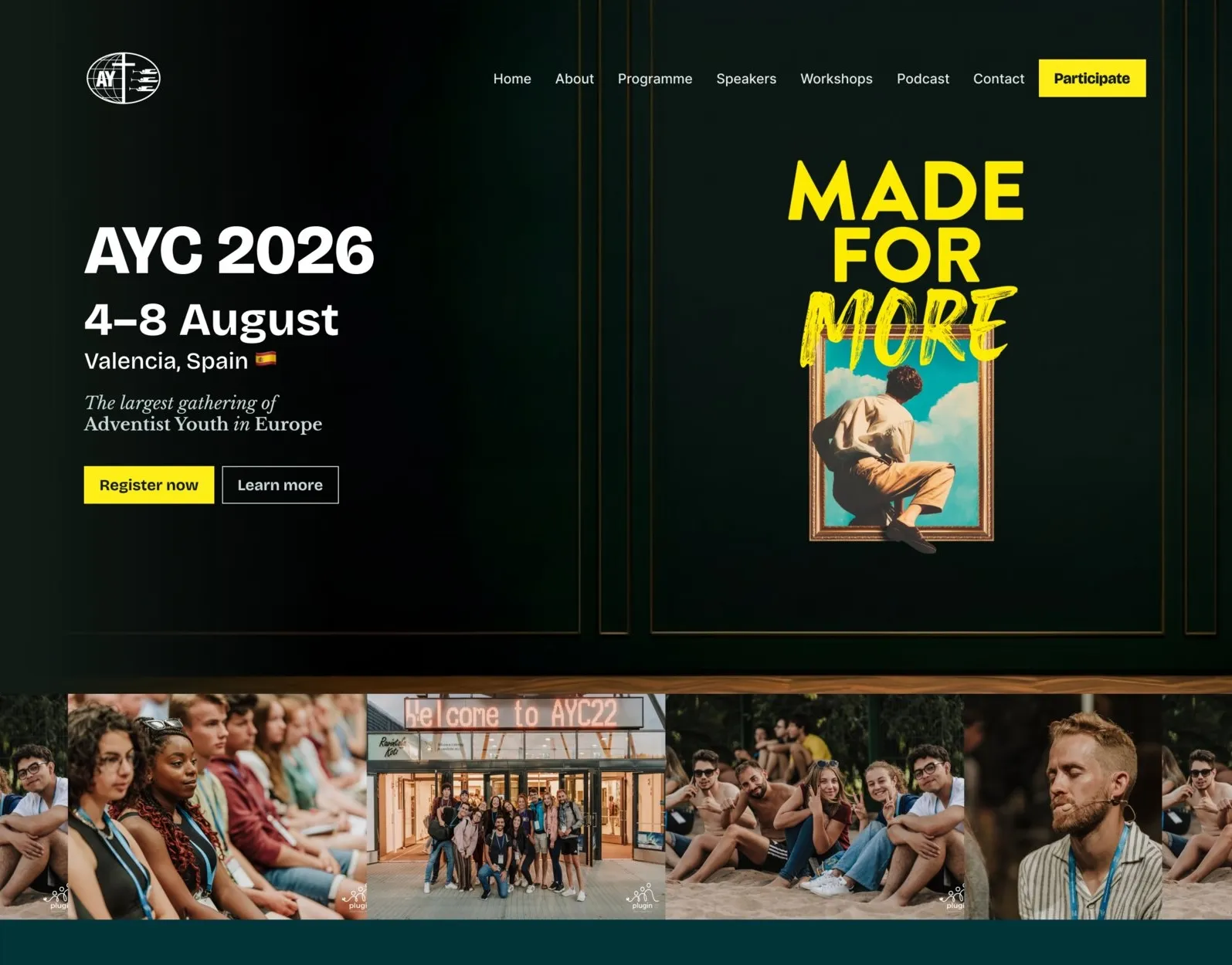
Role: Web Designer & Developer
Designed and built the full website for the European Adventist Youth Congress 2026, working from a poster, a few brand slides and a color palette as my only starting materials.
Timeline: ~5 months
Goal: A content-rich event website the client could keep updating themselves
Constraints: Minimal brand assets, content arriving in waves over months
Deliverables: Figma design, WordPress (Blocksy) build, ongoing content support
Outcome:
- Full event website live at aycongress.org
- Client able to independently update content as it came in
- Used as the primary registration and information hub for a multi-day international congress
Overview
AYC26 (European Adventist Youth Congress) is a five-day gathering of young adults from across Europe, held August 4–8, 2026 in Valencia, Spain, under the theme “Made for More.” My client, the organizing team, needed a full website to run registration, communicate the schedule, introduce speakers and workshops, and generally serve as the home base for the congress online.
When I came onto the project, I didn’t have a brand book or a set of design files to work from. I had three things:
- The official congress poster
- A handful of slides showing the direction they wanted for the brand
- A defined color palette (yellow, black, petrol, violet, orange, blue, grey)
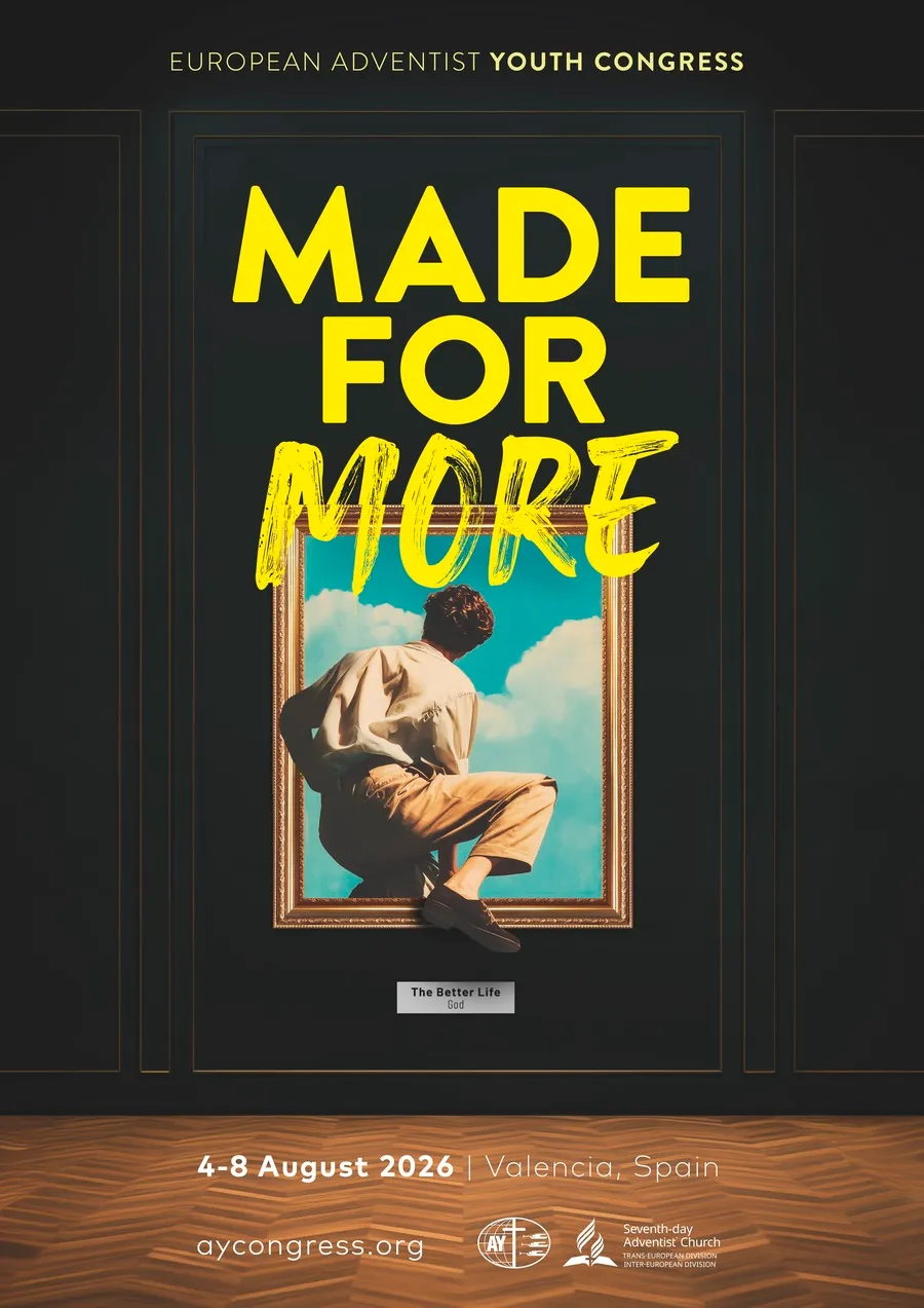
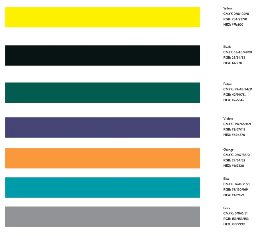
From that, I designed and built the entire site.
My Role
Web Designer & Developer (Freelance)
I was responsible for:
- Interpreting the brand direction from the poster and slides into a full website design
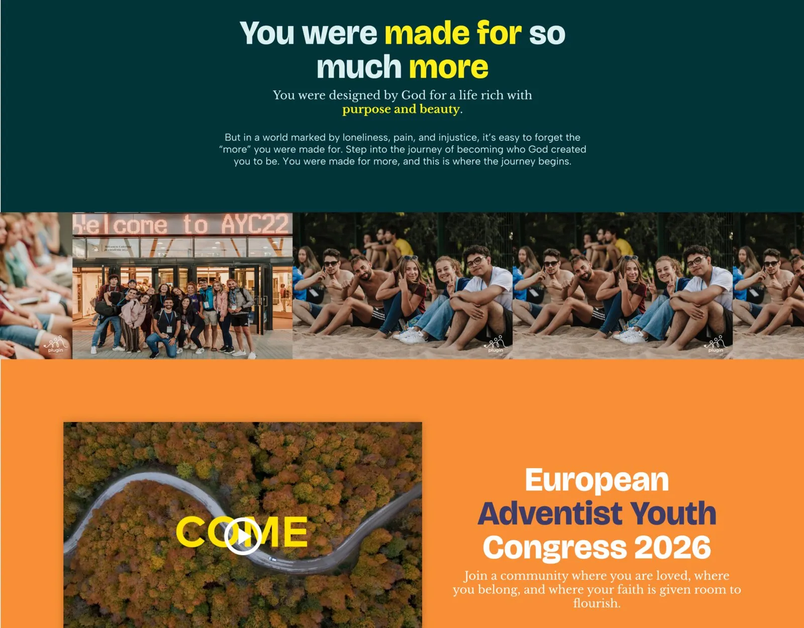
- Choosing the accent colors used across the site (from the palette I was given) for CTAs and section theming
- Designing every page in Figma
- Building the site in WordPress using Blocksy, so my client could edit content independently
- Collaborating with the client as new content (speakers, workshops, schedule items) rolled in over several months
- Designing dedicated sections for Programme, Participants and About, each with its own accent color
The Brand Direction
The poster’s visual theme was art: the “Made for More” artwork is styled like a painting stepping out of its frame, hung in a gallery. I leaned into that with an artsy, high-contrast look, with a serif display font for editorial moments alongside a bold sans-serif for headlines, set against the poster’s near-black backgrounds.
The palette gave me yellow, black, petrol, violet, orange, blue and grey to work with, but not instructions on how to use them. I made the call to use black and petrol (a dark teal-green) as the dominant backgrounds, yellow as the primary CTA color, and violet and orange as section accents, so the site would read as one brand while still giving each part of the content (Programme, Participants, About) its own visual identity as it moved from page to page.
Designing the Schedule
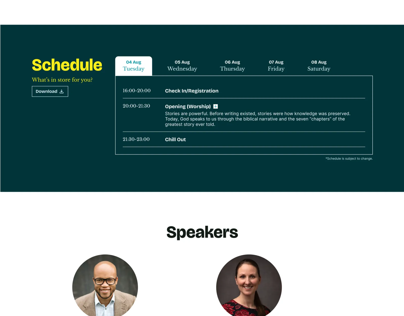
The schedule is one of the most essential sections of any event website, and one of the trickiest to get right. Some schedule items are just a title and a time slot (“Lunch,” “Chill Out”); others, like teaching sessions and workshop blocks, need a title, a description, and a named speaker, and have to expand without breaking the rhythm of the list.
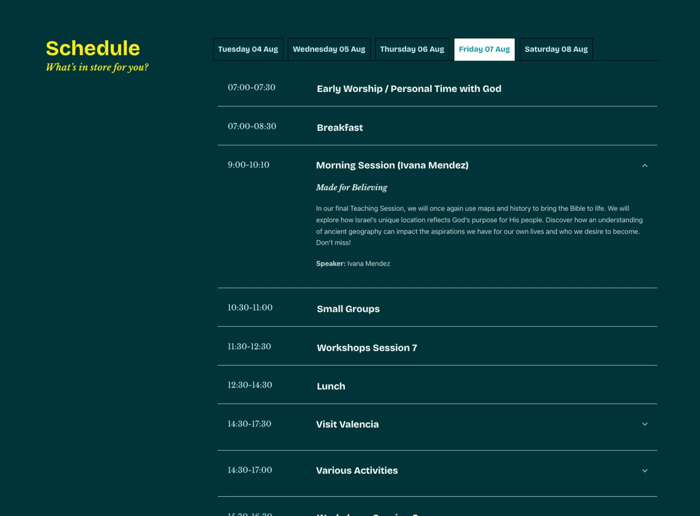
I designed the schedule as a day-by-day tab view, with each entry able to expand in place to reveal the extra detail when it’s there, and collapse down to a single line when it isn’t. It had to hold up visually on both the marketing side of the site and match the petrol/yellow styling established in the brand direction.
Designing the Workshops Page
The workshops page was, if anything, even more important than the schedule, and it’s the part of the project I’d approach differently if I started over.
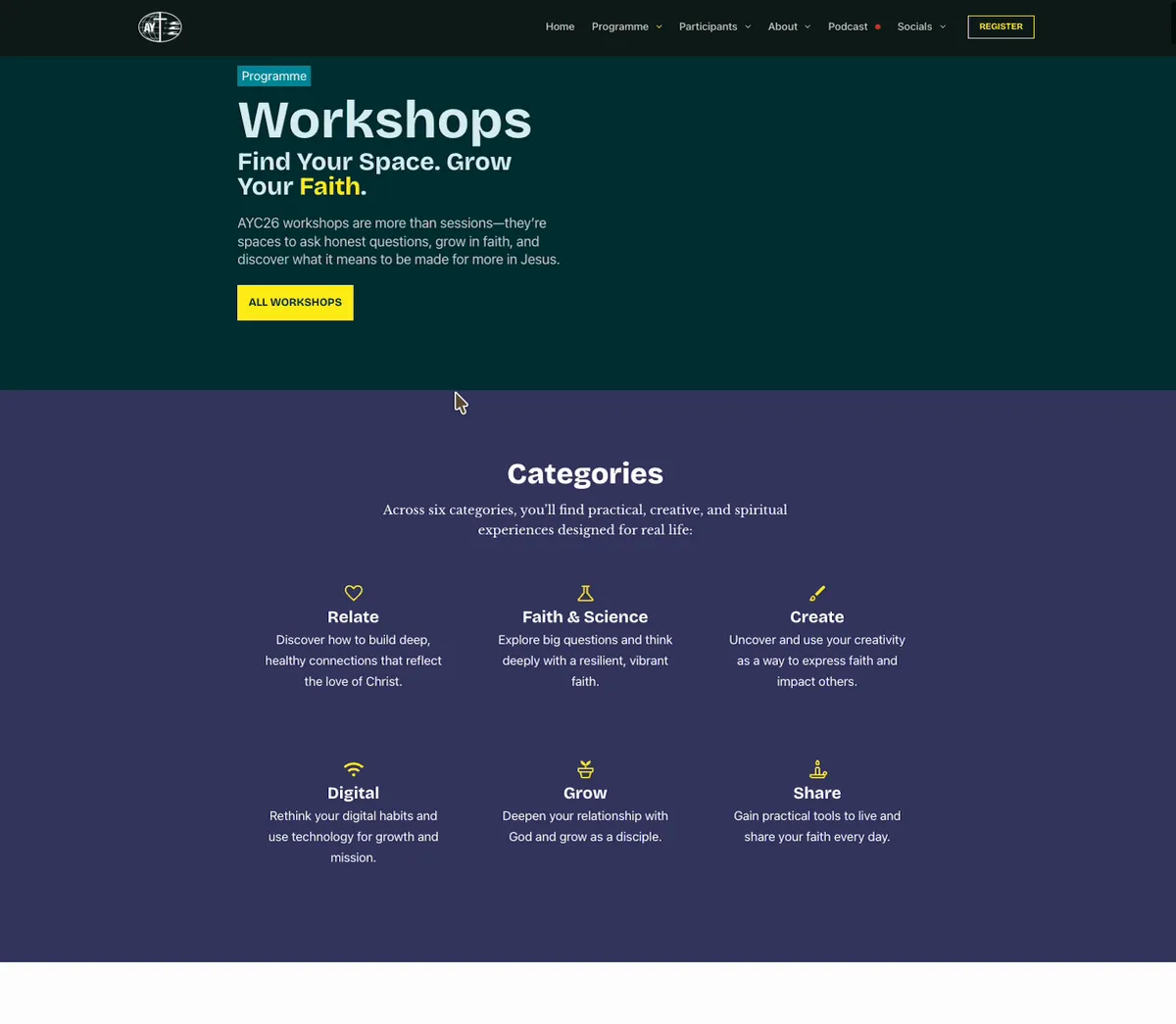
At the time I designed and built the page, the client wanted every workshop listed on a single page, organized by six categories (Relate, Create, Faith & Science, Digital, Grow, Share). I built a categories overview at the top of the page, and made each category name in that list a jump link that scrolls the user straight down to that category’s workshops.
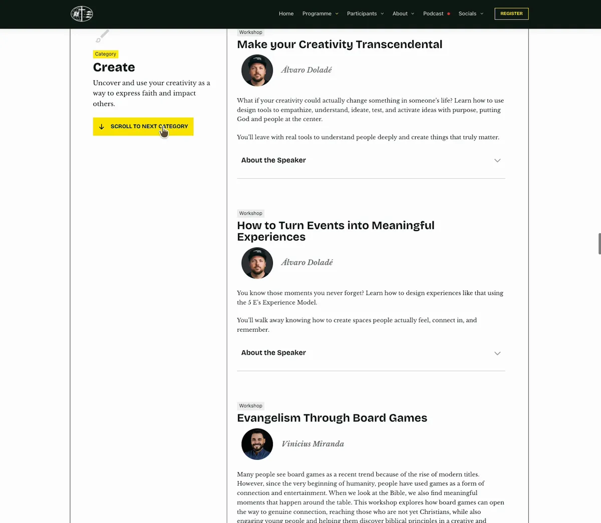
Within each category, I added a “Scroll to Next Category” button pinned alongside the category header, so users could keep moving through the page without scrolling back up to the top navigation every time.
What I’d do differently
The problem was timing: when I designed the page, we didn’t yet know how many workshops there would actually be, or which day each one would run on. The number kept growing, long after the layout was locked in, until the single-page list became genuinely hard to navigate, even with the jump links and the scroll button helping.
If I were starting this page today, I’d either install a dedicated search/filter plugin so users could narrow workshops down by keyword or category, or organize the page by the day each workshop takes place rather than by category alone. Neither was possible at the time, since the day-by-day breakdown wasn’t available yet when the page needed to go live.
Working with the Client
Content for AYC26 didn’t arrive all at once. It came in waves over the roughly five months of the project, page by page and section by section, as the organizing team finalized speakers, workshops and schedule details. That meant a lot of back-and-forth on how to best structure pages as new content came in, rather than building against a finished content plan from day one.
Because I built the site in WordPress with Blocksy instead of a custom framework, the client was able to take over updating content themselves once pages were built, swapping in new workshops, correcting registration links per country, and managing the schedule without needing me for every change.
”I MUST start by saying you have done an incredible job with the website!! It looks amazing!! Beyond my expectations! Thank you so much for doing all of this in record time!”
Reflections
- Working from almost no brand assets forced me to make real design decisions early: which colors carry which meaning, what the type pairing should be. I’m happy with how consistent the result feels given how little I started with.
- The Schedule section is the piece I’m proudest of: it had to flex between very simple and very detailed entries without looking inconsistent, and I think it holds up well.
- The Workshops page is the clearest lesson from this project. Designing a content-heavy page before the final content volume is known is a risk. Next time, I’d push earlier for a rough sense of scale (or build in a filtering solution from the start) rather than adding navigation aids after the fact.