Project Brief
Create a prototype of an event website for the upcoming Brooklyn Outdoor Film Festival. On this website, pre-registration will be possible and information will be displayed about the festival, upcoming showings and news and announcements about the festival.
This project was part of my online Front End Development Bachelor degree program on OpenClassrooms.com. You can read the entire project brief here.
An Exciting Challenge
I was super excited when I read the brief for this project, because I knew it would be an opportunity for me put my design skills to use, while also getting hands-on experience actually coding what I’d come up with from scratch. All I could say was… bring it on! 🙌
My Design Choices
Before even touching any code, I decided to start by taking some time to gather inspiration and make some design decisions up front since the project brief left a lot of room for that (Yay!).
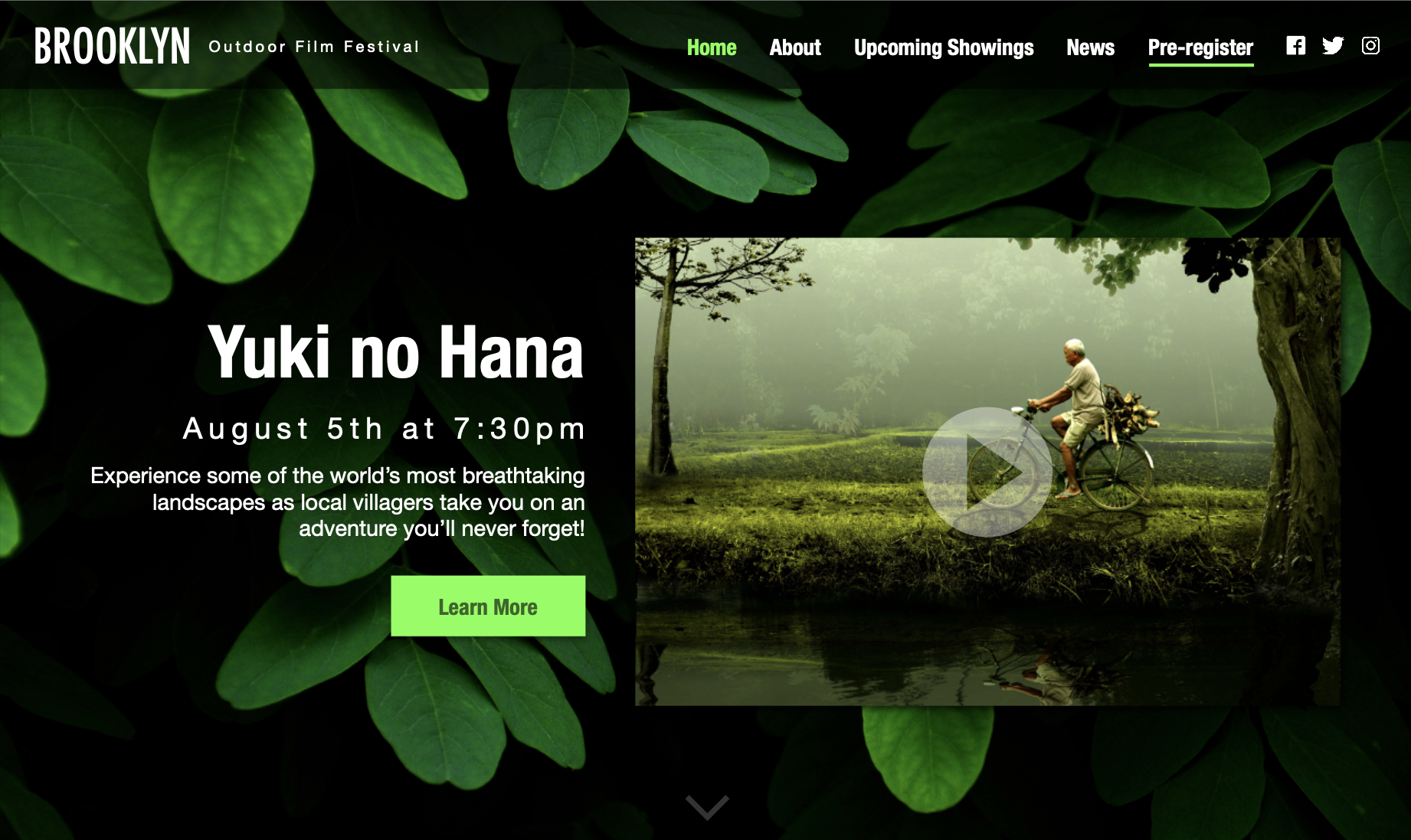
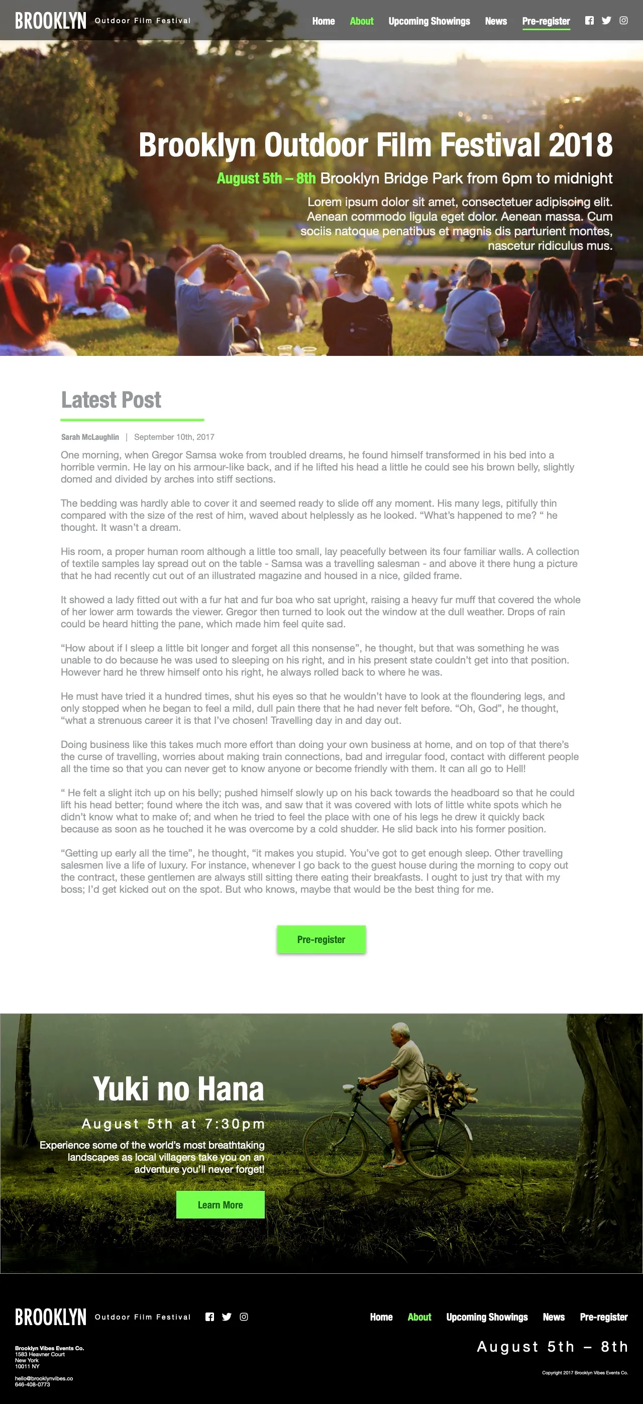
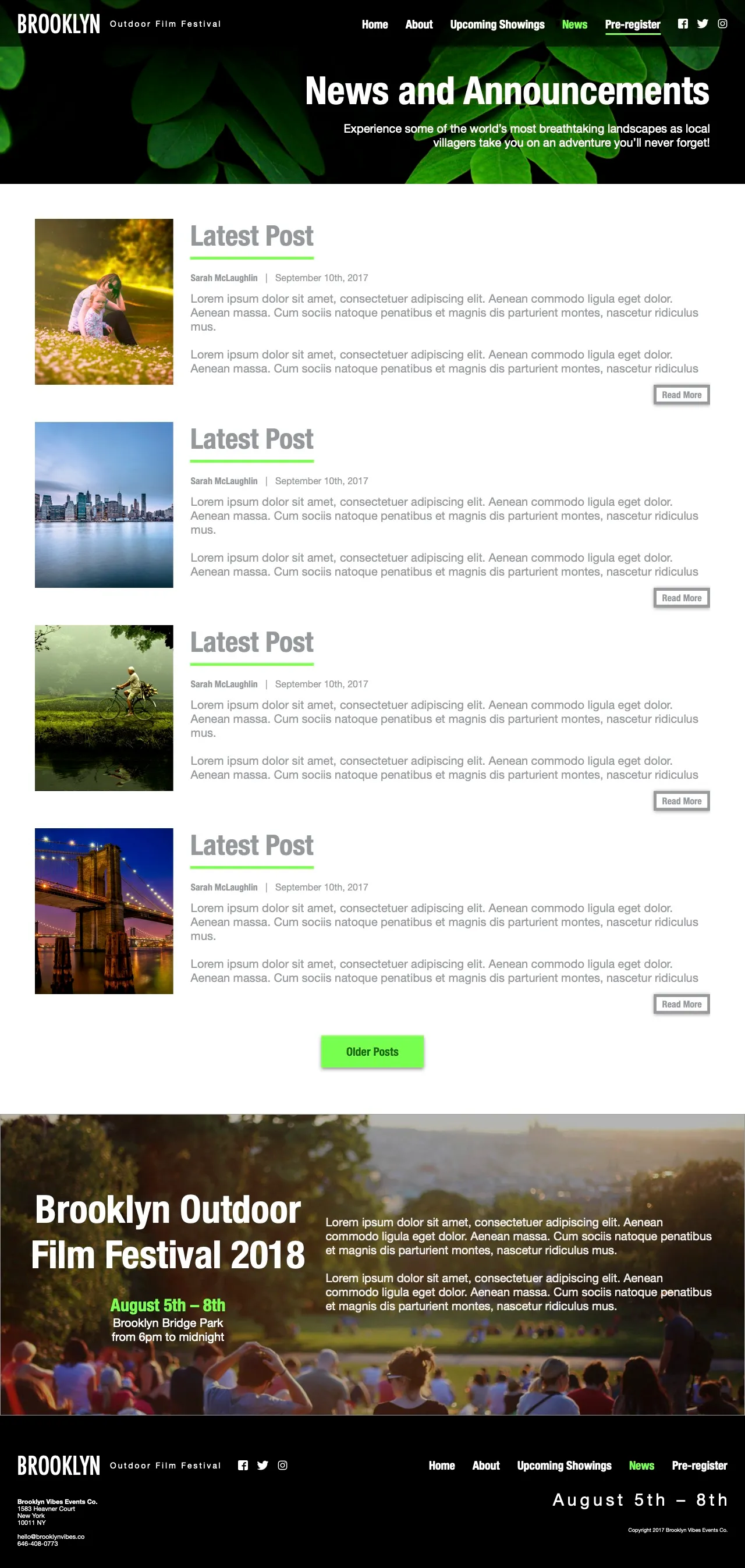
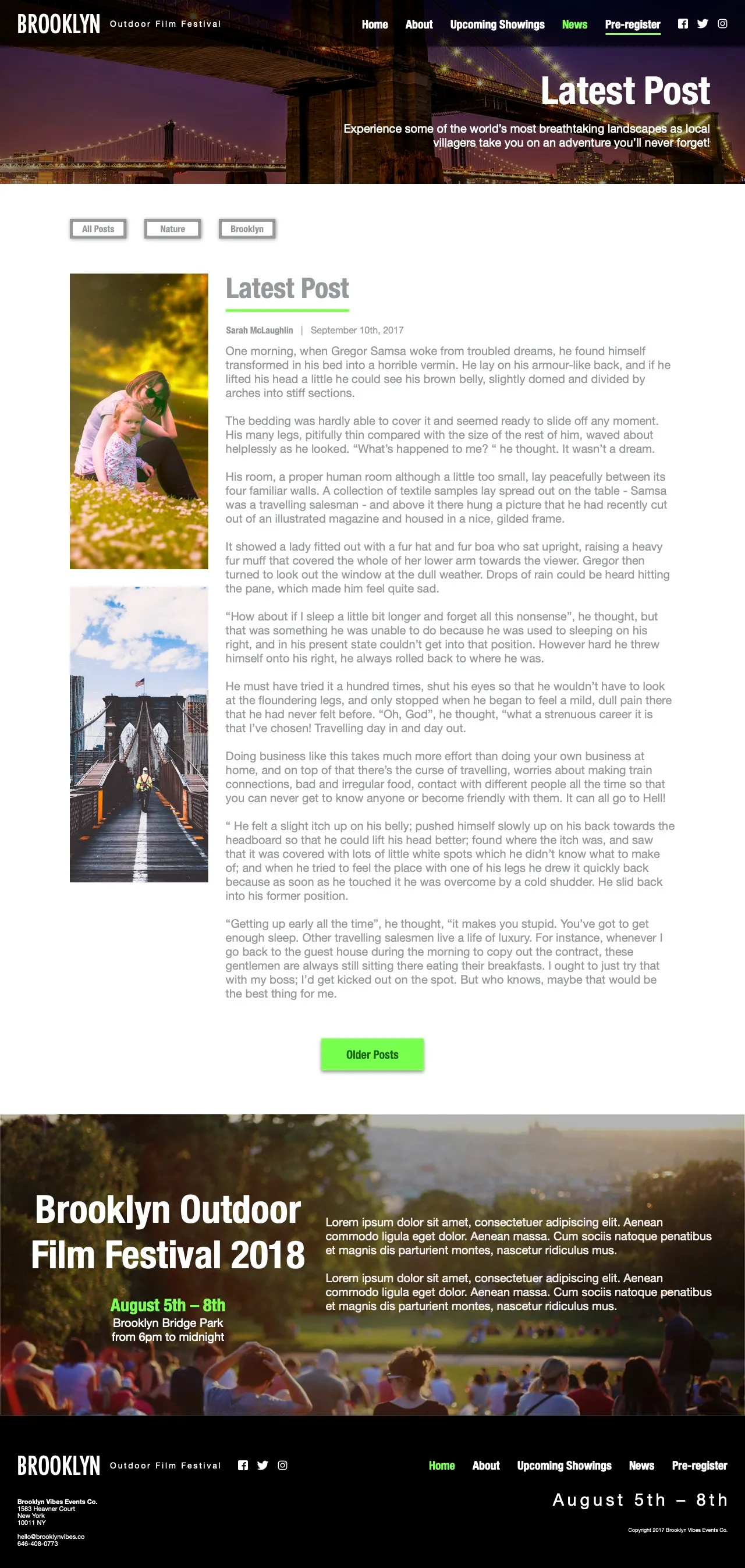
In the brief, the client expressed a desire to show, through this film festival, that films can appeal to audiences of all ages. Now, while I wanted parents to feel comfortable bringing their children to the festival, I didn’t want the design to look like it was made specifically for kids, which might turn of adults without kids. This, along with the fact that this is an outdoor film festival, inspired me to go for a nature-inspired design. I personally love nature and I wanted to have this outdoor film festival have a focus on nature and environmental issues. The films shown there would primarily be inspiring documentaries that helped viewers of all ages learn something valuable about the world we live in.
With this in mind, I started browsing around for inspiration. As I looked around at other film festival websites for inspiration, I saw certain design patterns that I quite liked because I thought they fit well with the brand that I was trying to create. I decided to adopt these into my own design for this project.
Some of those design patterns were:
1. Simple and modern
A simple design helps the site feel more modern while also creating a less distracting frame in which the content (i.e. the documentaries) would be the clear focus.
2. Bold: High contrast and bright colors
Though the design should be simple, it should be bold as this film festival aims to make a statement to the world about environmental issues. This later translated into high contrast between background and text and between the different sections on the pages.
3. Photography-heavy
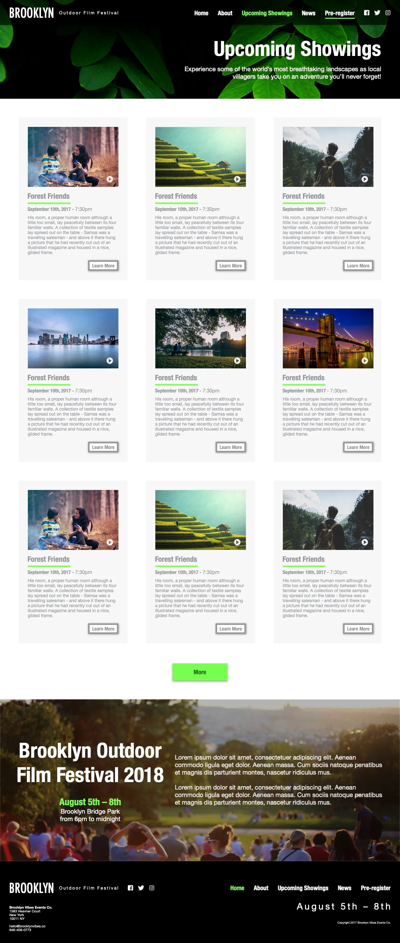
The films should be the focus, so there should be plenty of room and visual focus for large shots from all of the featured films.
After making these design decisions, I used Adobe Experience Design (XD) to quickly draw up a rich, hi-fi mockup of my entire website. This took some hours, but later on, I saw how it really payed off to have a well thought-out plan before writing a single line of code. Once I started coding, I was much faster because I had taken vital step and made the majority of the decisions from the beginning.
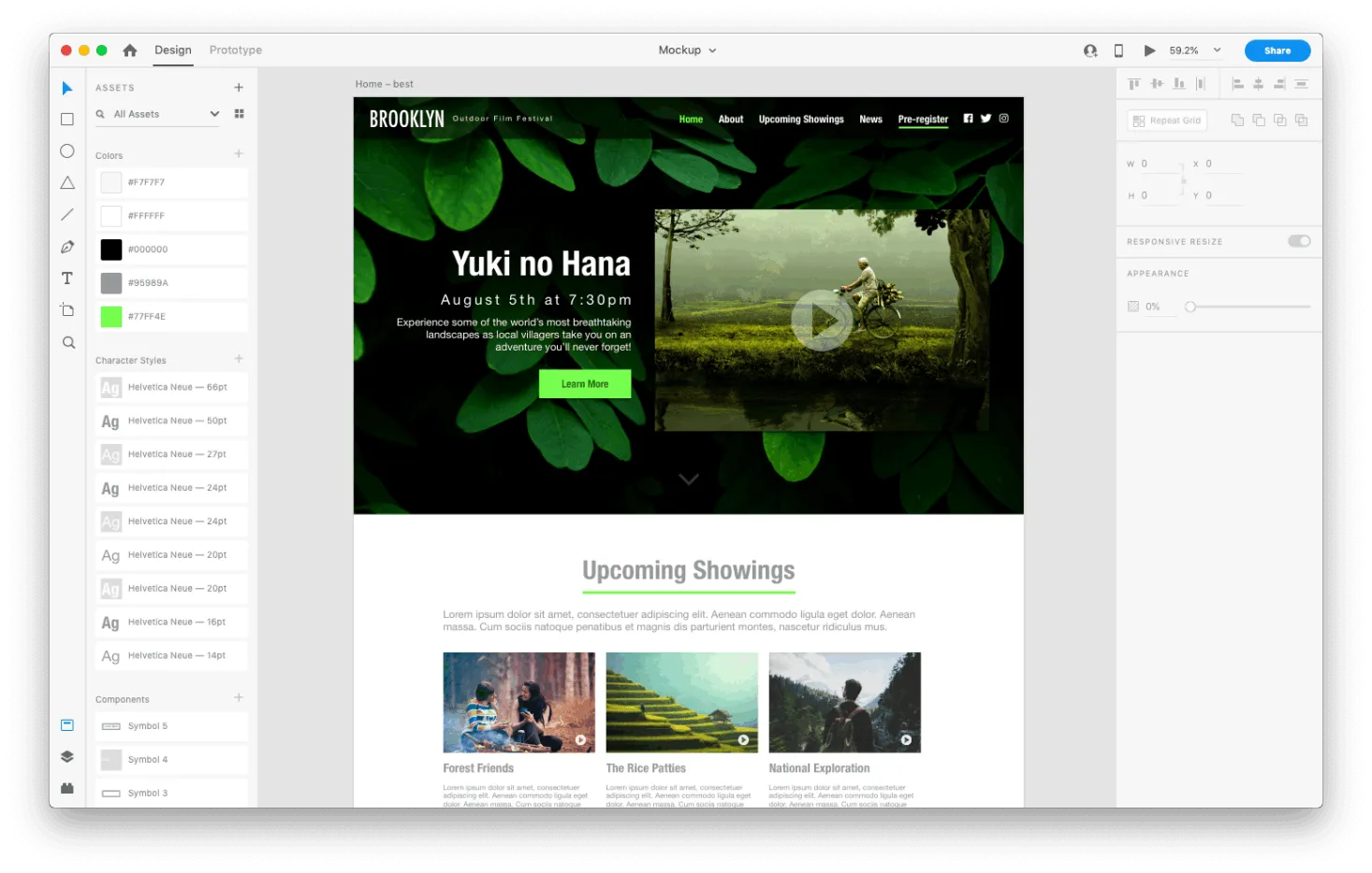
Using Bootstrap 4
This was not my first time using Bootstrap, but it was my first time using it to do anything more serious than testing and courses. I learned a lot about just how handy-dandy Bootstrap can really be.
For the list of films on the “Upcoming Showings” page, I decided to use Bootstrap 4’s card columns instead of trying to make it from scratch. Since the amount of text in the short description of each film changes from film to film, I thought the masonry-like columns would be ideal. This was just one example of the ways that Bootstrap saved me a ton of time.
I guess that’s what Bootstrap is for, right?
The Finished Product
Try the live demo


All the Time in the World
If I had all the time in the world just to work on this project…
I would spend more time tinkering and figuring out how to make the final prototype look more like the original hi-fi mock-up. Among others, some of the changes would be:
- UI - Adjust certain things to improve the user experience, for example highlighting the “Pre-register link in the navigation bar, making film thumbnails clickable to show the trailer.
- PERFORMANCE - Optimize images for much faster loading.
- FONTS - Add in a couple more nuanced font styles just to add that extra special touch.
- PIXEL PERFECTION - Fix the little details like inconsistent spacing (ex. margins and padding) throughout the site.
- CLEAN CODE - Tidy up and optimize my code.
But luckily, I don’t have all to spend all of my time on one project. Even though a project is not perfect, I can move on to other awesome projects and keep learning as I go. That is a priviledge and a blessing.