Noteo: Timestamped notes that give context
End-to-end SaaS product design and development
Noteo lets you save interactive timestamped notes alongside any video, so you can capture and revisit what you learn, instantly.
The problem
I consume tons of educational video content every day; from podcasts to tutorials about just about anything. Whenever I have a question, I open YouTube and find a video explaining it.
But when I want to save an insight for later, how do I actually do it? Dropping the link into a notes app and writing what I learned beside it means that months later, I’m scrubbing through an hour-long video trying to find the exact part where it was mentioned.
I decided to design and build Noteo, from scratch, to solve this exact problem.
The solution
Noteo lets you save interactive timestamped notes alongside any video, so you can capture and revisit what you learn instantly. It’s like a home for your video insights.
UI/UX Design Process
Once the idea for Noteo had been floating around in my mind for weeks, I decided to sit down and put together some sketches on paper and then into Figma.
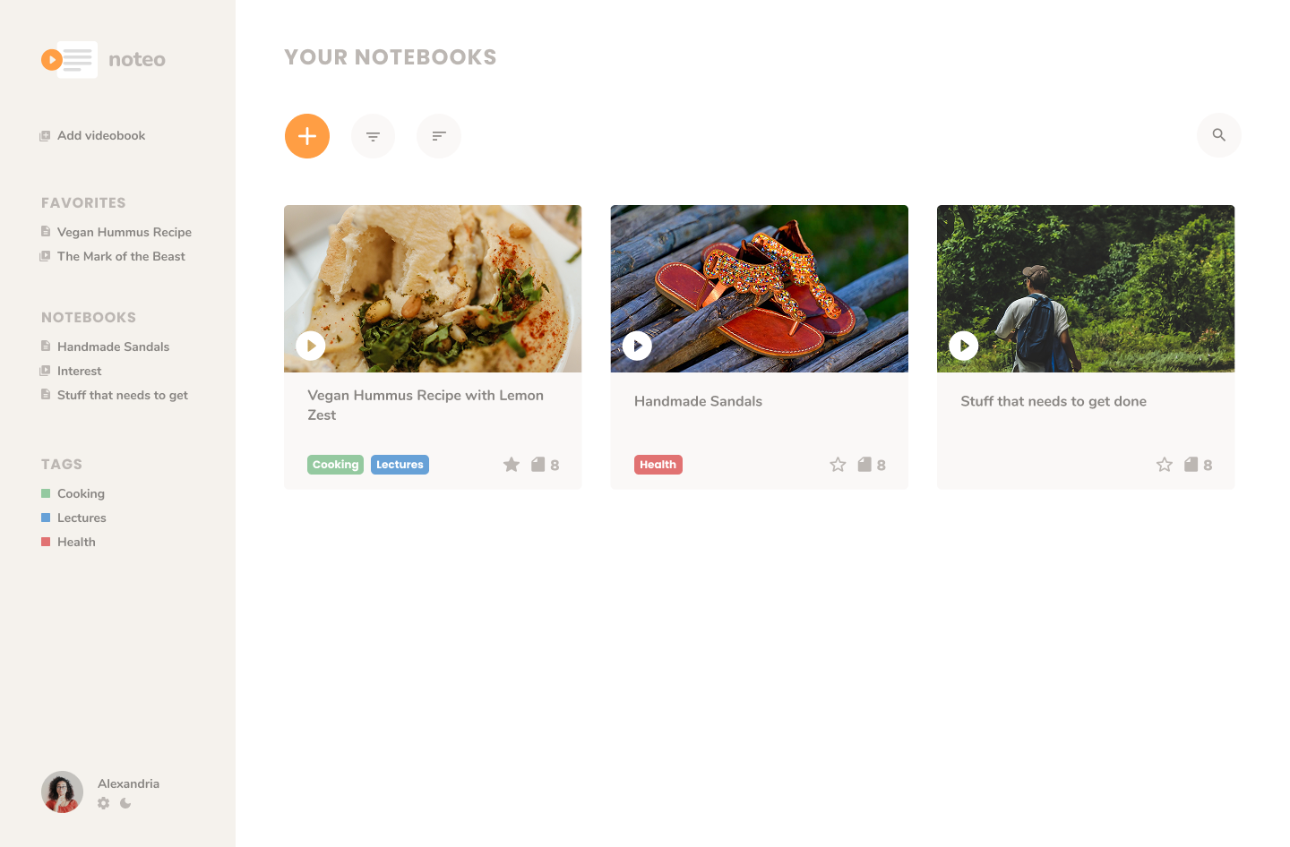 My video notebooks
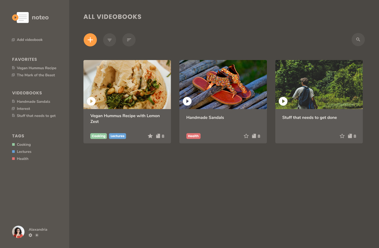 My video notebooks (dark mode)
Video Player Page
Noteo would give users “video notebooks” which consist of one video and several timestamped notes that, when clicked, cause the video to automatically skip forward to the time on the note.
Eventually, I decided that having the notes to the right of the video player would be better than having them below the video. This would:
- Allow users to see more of the notes at once (giving the user more oversight)
- Bring the notes more front-and-center, since this is what the user is really here to interact with. The notes are notes should be easily visible and easy to interact with.
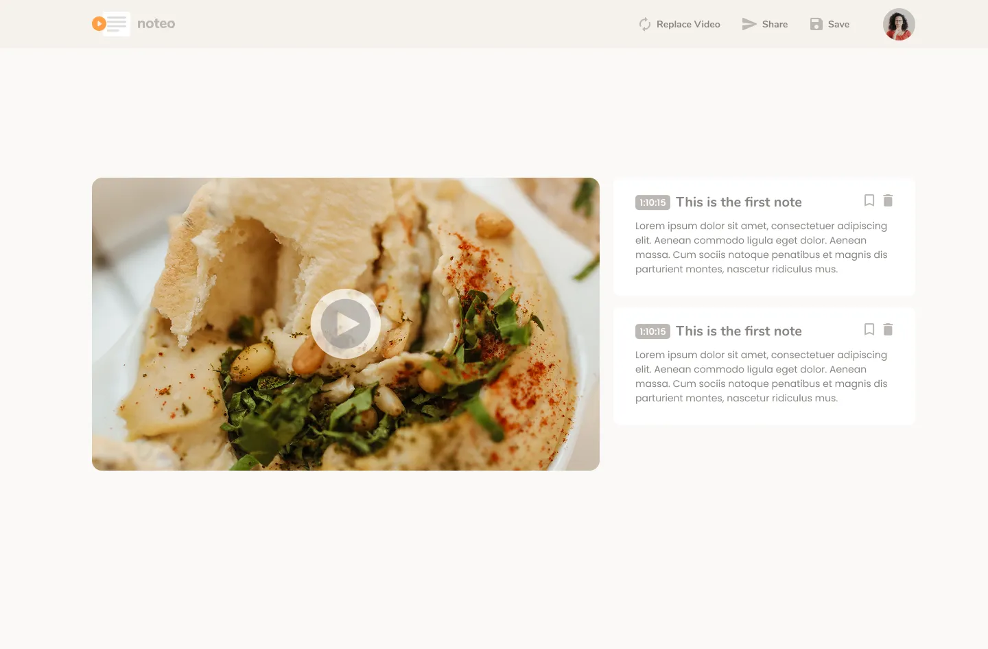
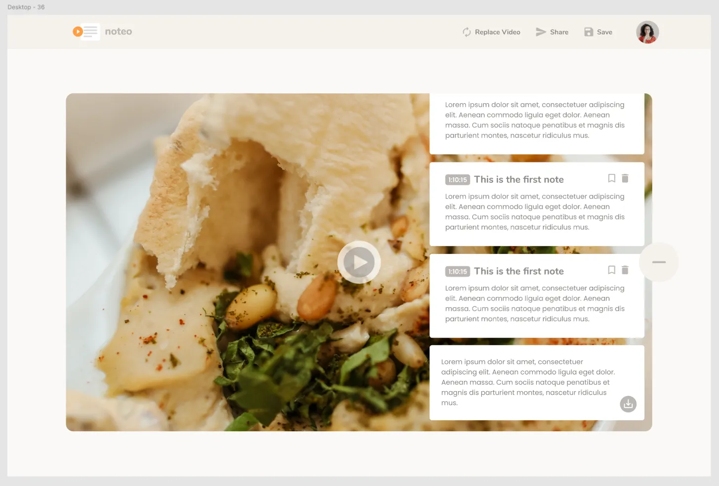
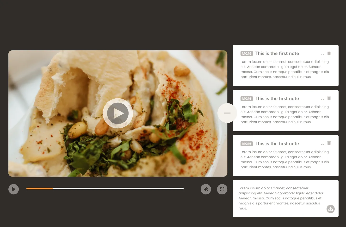
Having the sidebar live next to the video player allows users to comfortably watch the video while also interacting with notes. Instead of having to close the notesbar while watching the video.
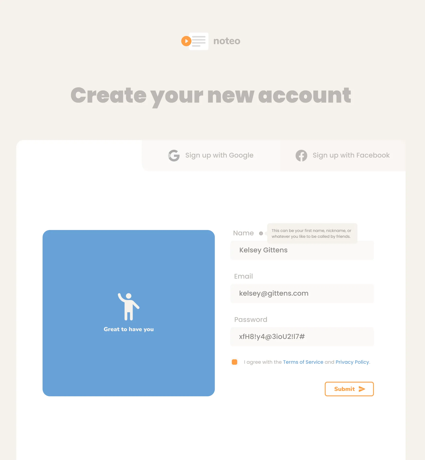
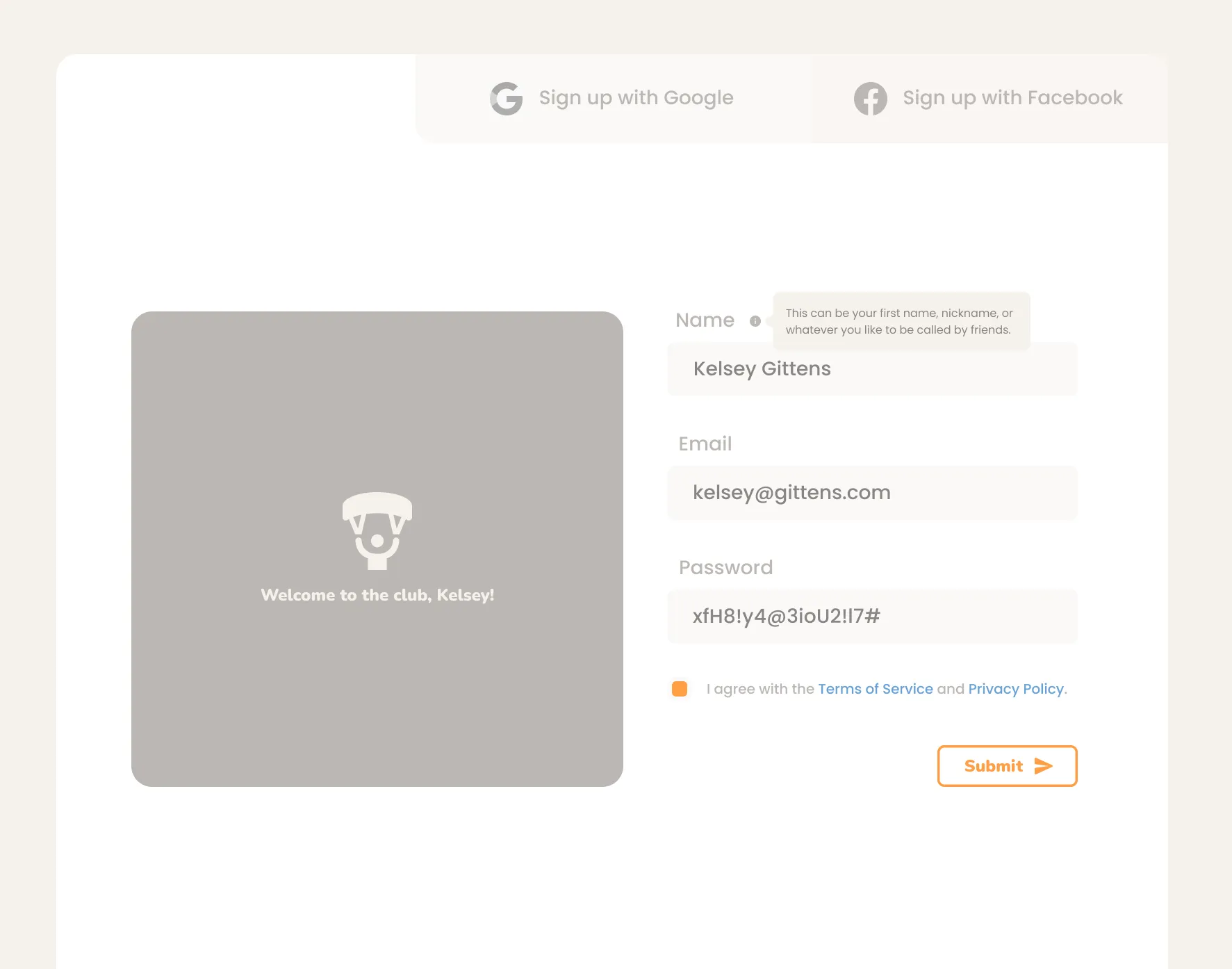
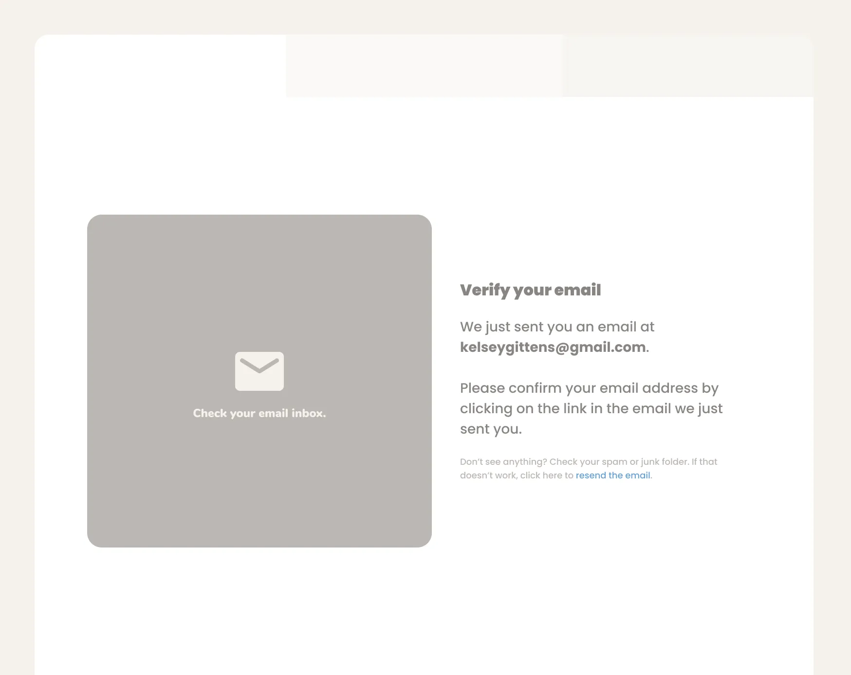
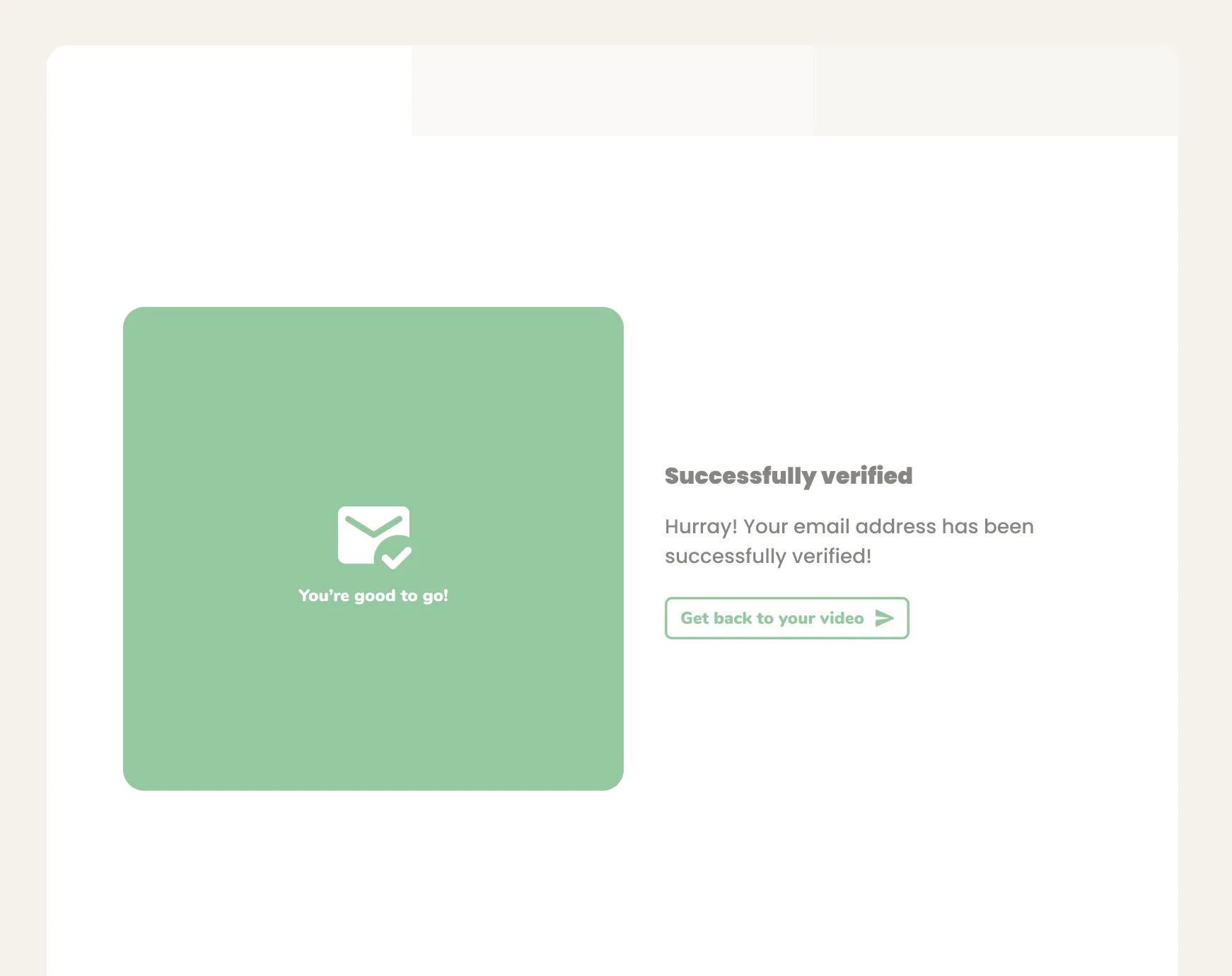
Account Creation
Knowing that the signup process is often a point where users drop-off, I felt it would be crucial to get users excited about signing up from the start of the signup process and keep them excited throughout.
In order to achieve this, I chose to:
- Only ask for the bare minimum in the signup form, in order to keep the process as short as possible, and therefore the threshold low.
- Make it feel playful
- Make user of visual cues that encourage users to proceed.
Icon boxes
One UI element I designed to accomplish the last point was what I call the “Icon Box” - a custom component.
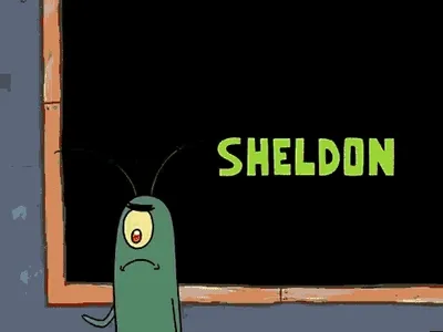
The Icon Box component was inspired by those talking screens you often see in sci-fi movies (and in Spongebob) where the robot communicates with the outside world through a blank screen that simply displays some text or basic visuals.
I used these Icon boxes as a way to almost dialog with the users. The icon box (large blue box on the left), would almost be like a coach cheering the user on ever step of the way. Almost like a faceless mascot for Noteo.
Development stack
I developed the first version of Noteo using Next.js (with Typescript) for the front-end. The main reason I used Next.js was because I was very familiar with React and had some experience with Next that made me believe it would work well for a production-level MVP.
I used supabase for the backend because I knew I didn’t need a very complex backend setup and I’m much less confident in my backend development skills. I knew I could create a solid user interface and I was looking forward to spending my time on that, more than anything else.
Reflection
I can barely put into words how much I enjoyed building this first version of Noteo.
There are so many things that I see when looking at my first version of Noteo that I would do differently. But that’s what I love about UI/UX design, there’s always something that can be improved in a next iteration.
Color palette contrast
My main issue with this first version of Noteo, is the lack of contrast in the color palette. This is something that got pointed out by users very early on. I’ve improved this in subsequent versions of Noteo, because it’s definitely the most problematic issue. It makes Noteo unusable for persons with different visual impairments.
Also, I do feel like the color palette leaned a bit too soft and feminine, which could have turned users of some demographics off.
Figma organization
Because I was focused on getting my ideas out quickly, I didn’t spend much time keeping my Figma page organized. My layers and pretty much everything about the page is a mess. This is something I would definitely spend more time on if I weren’t working alone.