Role: UI/UX Designer
Designed the landing page and course catalog pages for De Praktijkcampus, a vocational training institution in the Netherlands, for both desktop and mobile.
Timeline: Mid-November 2025 to end of January 2026 (~2.5 months)
Goal: A website that speaks to four very different audiences without confusing any of them
Constraints: Starting from a logo and color palette only, no existing site or content
Deliverables: Full Figma design for the landing page and course catalog, desktop and mobile
Outcome:
- Live site at praktijkcampus.nl
- Dedicated pages and CTAs for each of the four audiences the client needed to reach
- A catalog layout that scales as new courses are added
Overview
De Praktijkcampus is a network of vocational training locations in the north of the Netherlands (Groningen, Drenthe and Friesland), training people to become plasterers, painters, welders, carpenters and other skilled tradespeople. The Netherlands has a real shortage of these craftspeople, and De Praktijkcampus exists to close that gap: training students, upskilling working professionals, and partnering with employers and government agencies to get more people into skilled trades.
I was brought on to design their landing page and course catalog pages. When I started, there was no existing website to redesign, just a logo and a color palette.


The Challenge
The biggest challenge on this project wasn’t visual, it was structural. The site had to serve four genuinely different audiences at once, each with a different reason for being there:
- Students leaving school, looking to become a professional in a trade
- Working craftspeople seeking further education or specialization in a new trade
- Employers wanting to get their own employees trained
- Government “verwijzers” (referrers), caseworkers looking for institutions to send subsidized trainees to
A single generic “welcome to our school” homepage would have underserved all four of them. Each audience needed to find their own entry point fast, without the other three cluttering it up.
Designing for Four Audiences
The solution we landed on was to split the homepage hero itself by audience, right from the first screen. Instead of one hero message, there are three: a general “Voor iedereen een vak” (a trade for everyone) card pointing students toward courses, an employer-specific card (“Laat uw werknemers opleiden,” or “have your employees trained”), and a card addressed directly to referrers (“Bent u een verwijzer?”, or “are you a referrer?”).
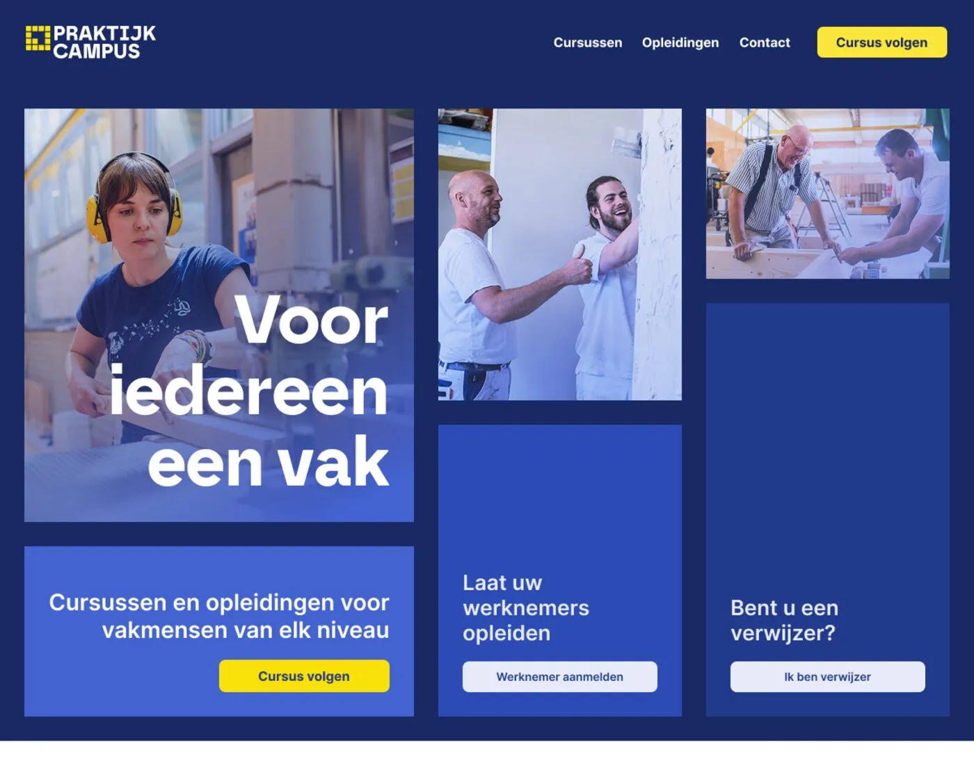
That same split carries into the main navigation, where Cursussen (courses), Opleidingen (programmes), Werkgevers (employers) and Verwijzers (referrers) each get their own top-level page, so a caseworker or an HR manager never has to dig through student-facing content to find what applies to them.
The homepage itself still had to build trust and explain the mission for everyone landing on it regardless of audience, so below the hero I designed sections establishing credibility (partner logos including Rijkswaterstaat, a government agency, which reinforces trust for the verwijzer audience specifically) and De Praktijkcampus’s value proposition.

The Course Catalog
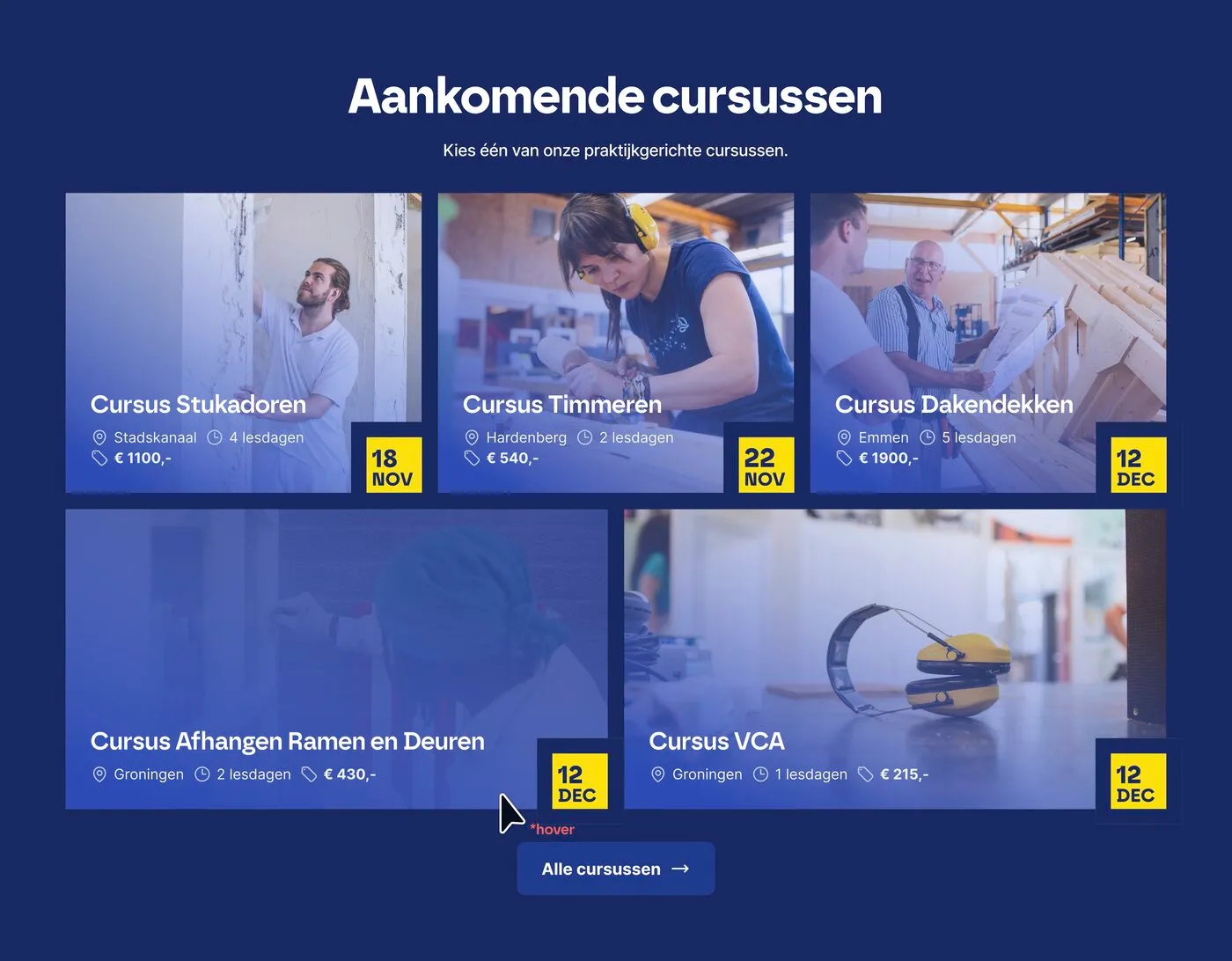
The other core deliverable was the course catalog page. On the homepage, a small preview grid of upcoming courses is enough to give a taste, but the dedicated catalog page had to hold the entire course offering and still be easy to browse.
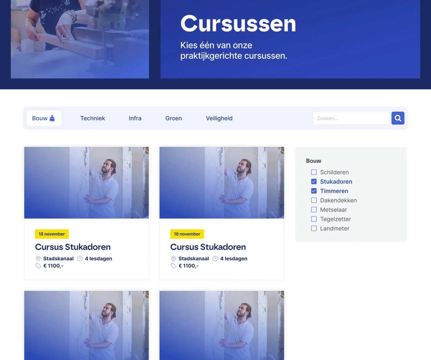
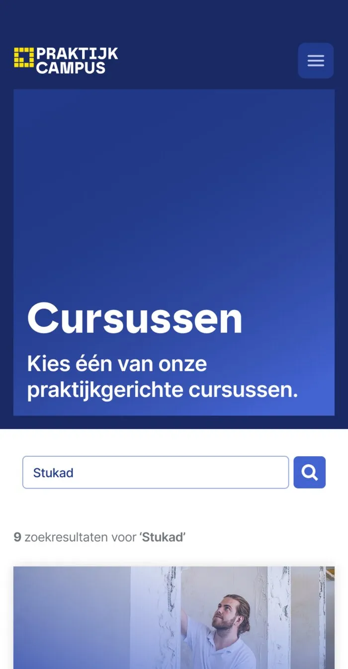
I designed the catalog page around top-level category tabs (Bouw, Techniek, Infra, Groen, Veiligheid), with a sidebar of sub-category checkboxes for narrowing further within a category, plus a keyword search that updates the result count live (“9 zoekresultaten voor ‘Stukad’”). Each course card shows location, duration, price and start date at a glance, since those are the details someone actually deciding between courses needs to compare, and pagination keeps long result sets manageable instead of turning into one long scroll.
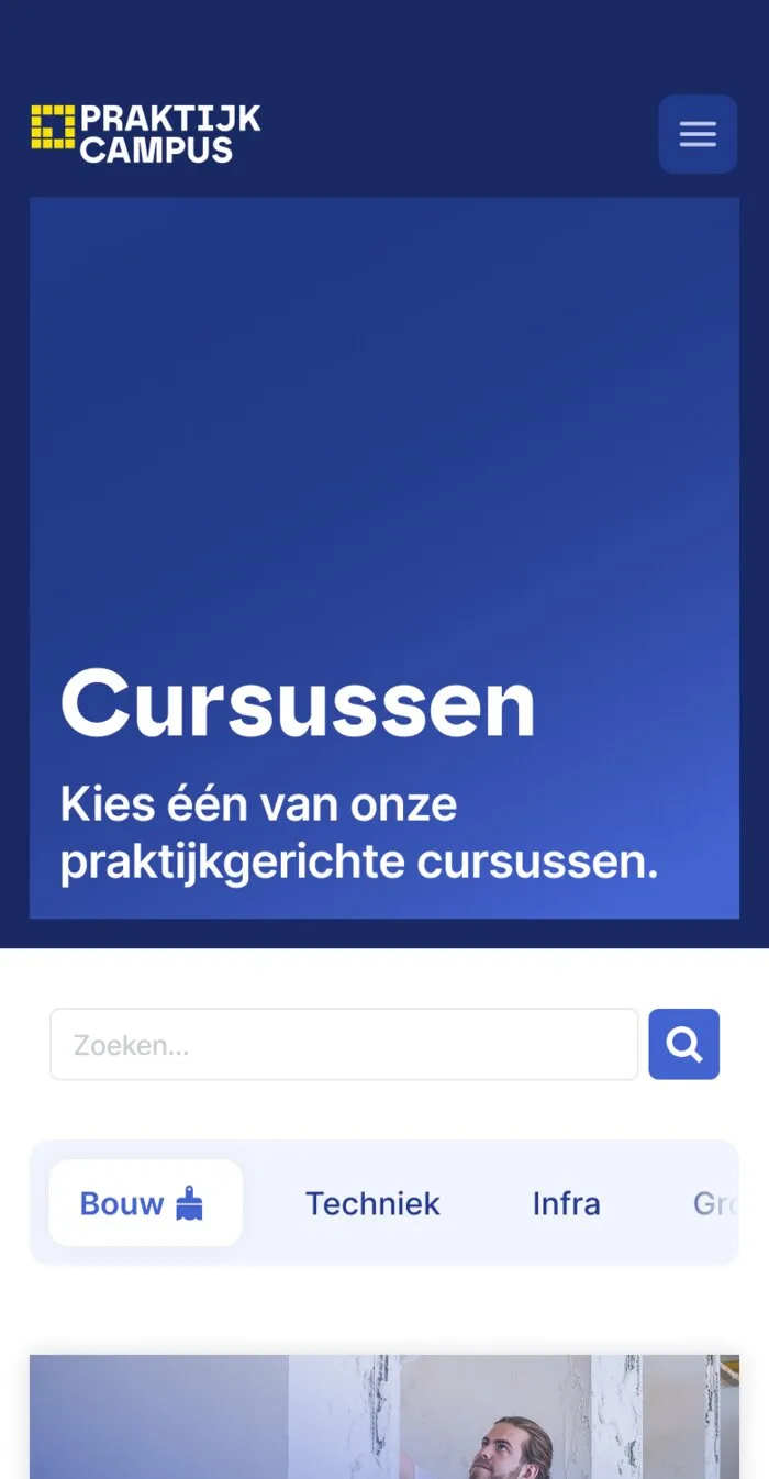
I designed every page, including the catalog, for both desktop and mobile. On mobile, the category tabs and sidebar filters collapse into a single horizontal tab row above the search bar, so the filtering logic stays the same even though the layout changes completely.
The Agenda Section
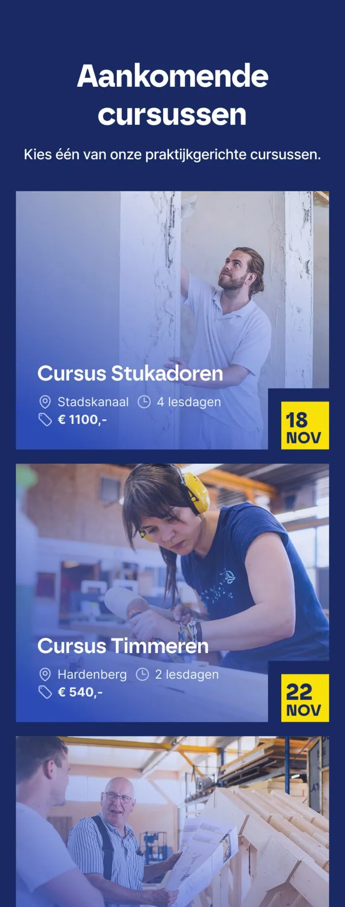
I also designed the “Aankomende cursussen” (upcoming courses) agenda section, an asymmetric grid highlighting the next few courses on the calendar, with its own mobile adaptation stacking the cards into a single column.
Values and Trust
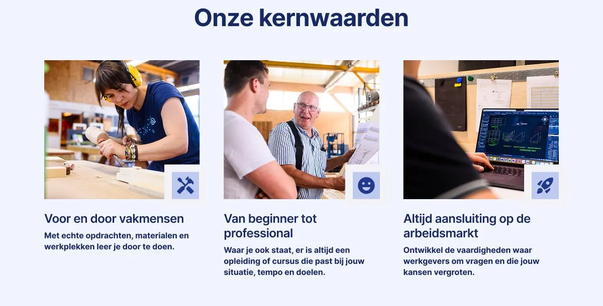
Because a lot of visitors would be evaluating whether to commit real time and, for some audiences, real budget, to a training programme, I designed a “kernwaarden” (core values) section to reinforce credibility further down the page: hands-on learning, support at every skill level, and a direct line to employment afterward.
Reflections
- Splitting the hero by audience was the right call for this project. It’s a simple pattern, but it solved the core challenge directly instead of trying to write one message vague enough to work for everyone.
- Designing the course cards to double as both a homepage preview and a full catalog layout kept the design system small, which mattered given the compressed timeline.
- Working from just a logo and a palette, with no existing content to react to, meant a lot of the early design decisions were really content decisions: what each audience needed to see first, and in what order.