Task
Research and design the UI of a Bible e-learning platform
Client
I worked on this project with a Swedish client of mine to prepare the project for their client in Finland, a small Christian foundation.
I was called onto this project early in the design process. At this point, there were some low fidelity wireframes that had been designed by my client’s designer, Sara and the main stakeholder.
At first, Sara and I did some basic user tests together with some low fidelity wireframes that had been designed Sara and the main stakeholder.
After some testing of the desktop wireframes, my task was to conduct some user tests on the mobile wireframes with users unrelated to the project.
User Research
I conducted one user test based on a low-fidelity mobile prototype that was already there before I joined the project.
At the beginning of the test call (a video call on Google Meet), I explained what we’d be doing during this test. I asked the user to share his screen. I also asked the user to think out loud so I could follow his train of though when interacting with the prototype.
I recorded the user interacting with the app while I painted a scenario for the user and asked him to complete certain tasks.
For example:
“You have a question about something you’re curious about in the lesson. How would you find out the answer to your question?”
Analysis
From the recording of the user test, wrote down ever statement or notable behavior (or hesitation) on the part of the user. My goal was to be as objective as possible and simply write what I saw happen or what the user said he was thinking or feeling.
I wanted to avoid drawing any conclusions at this point as I know this can lead to missing what is truly happening, which in turn can lead to faulty user insights.
Once Sara and I had completed multiple tests and gotten done writing everything down, we went through all the points we wrote down together and color coded each one. Green for good, yellow for neutral and red (or sometimes orange) for bad. This would help us quickly scan through all the points for areas of improvement or positive things we should hold on to.
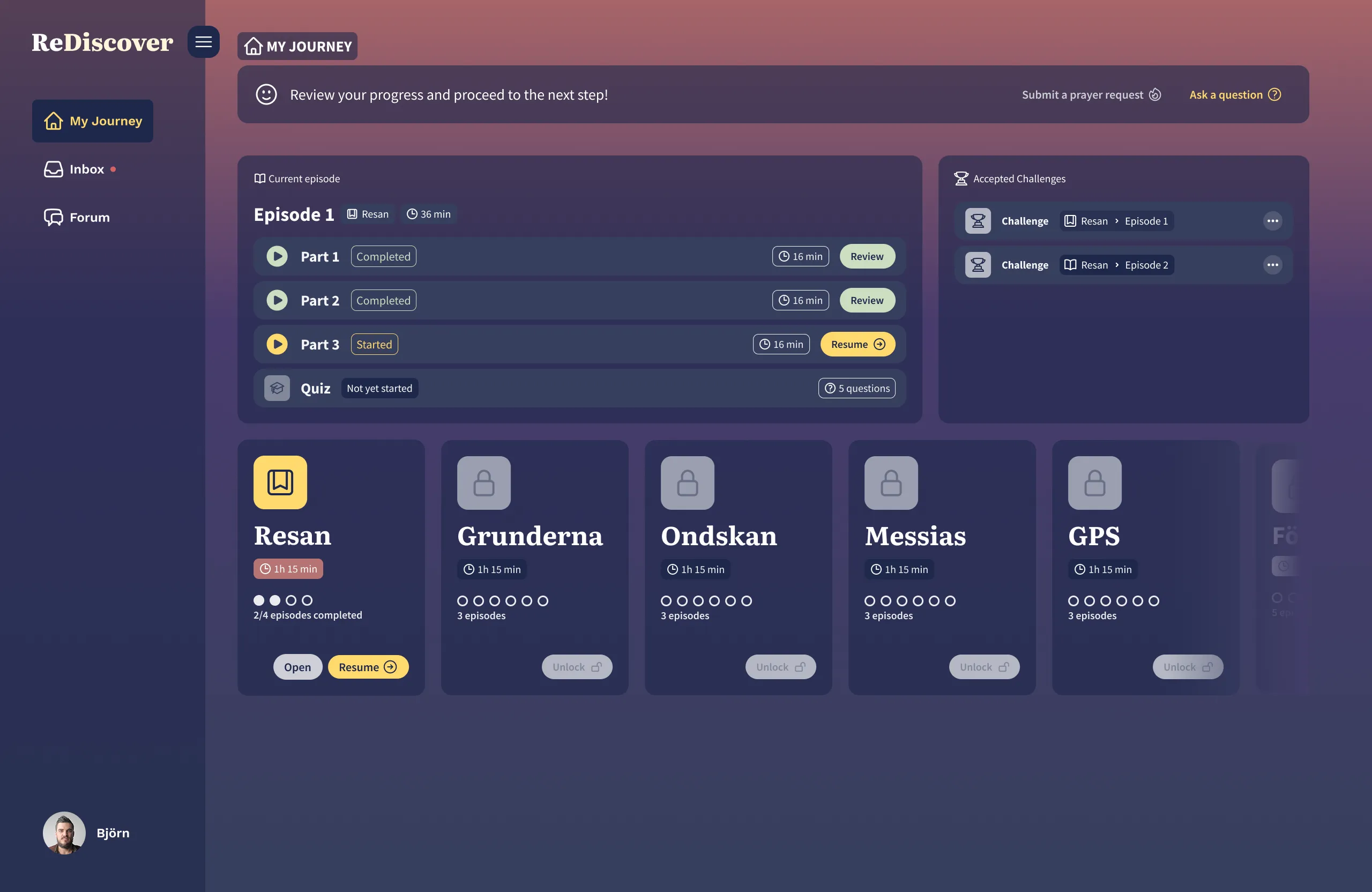
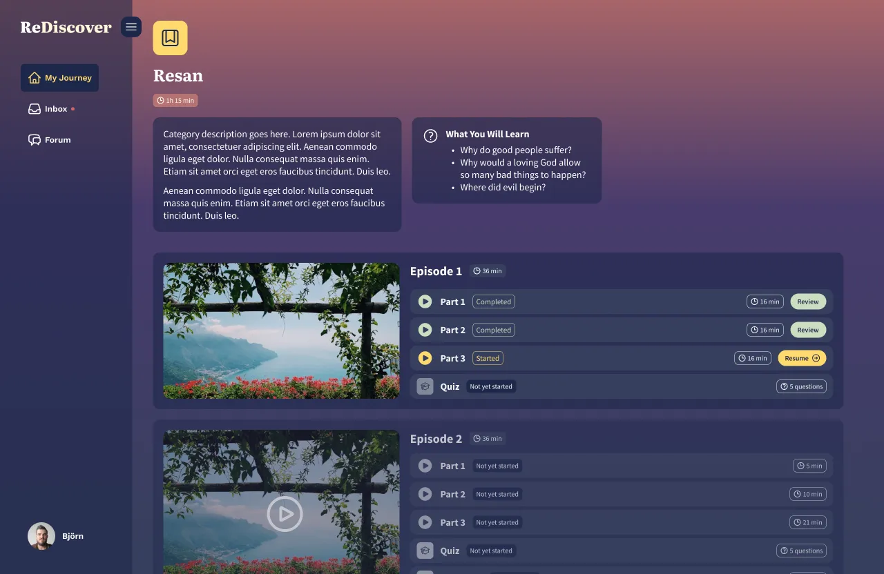
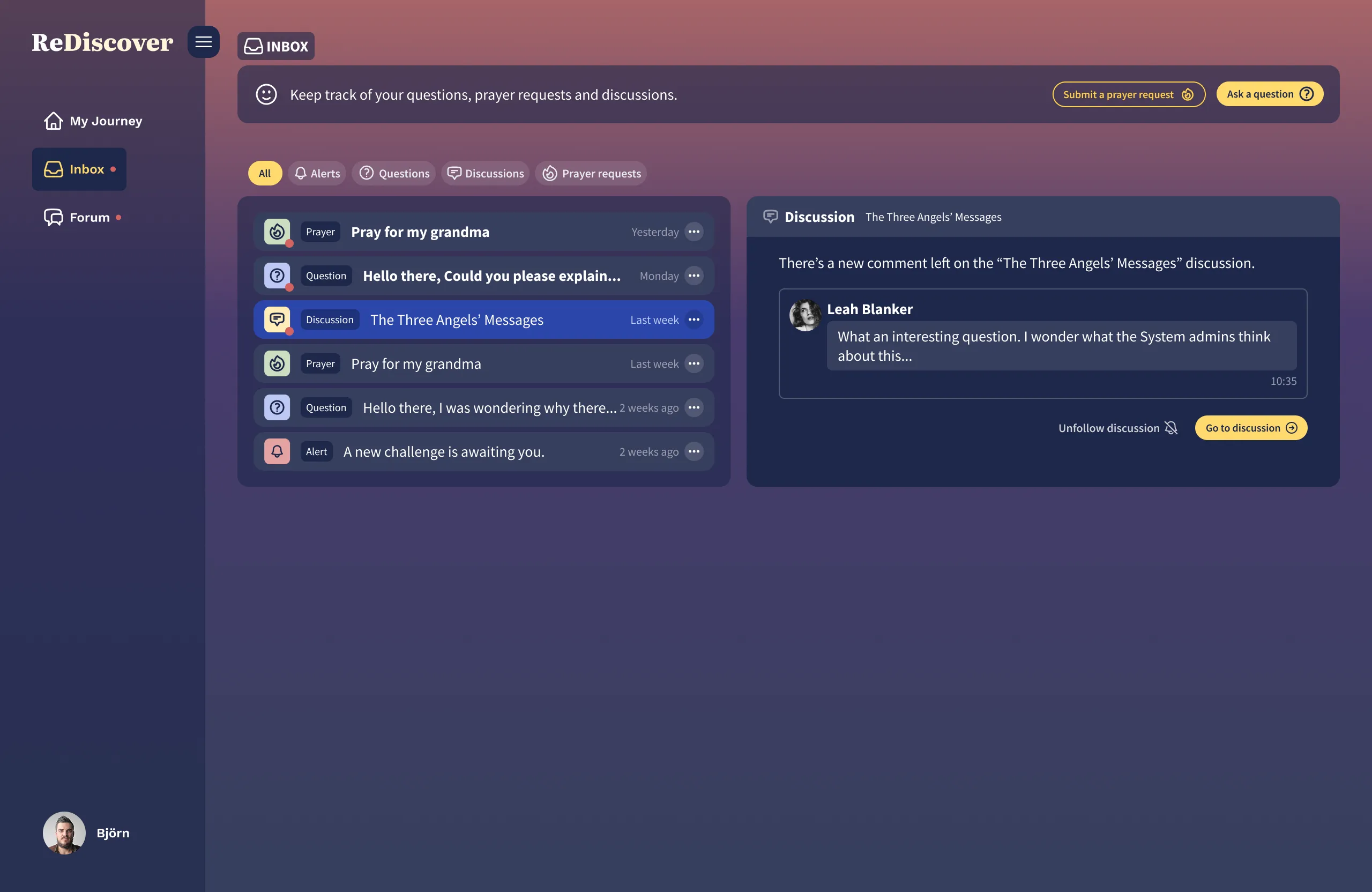
We then focused on formulating recommended and suggested action points that Sara would later discuss with the client. We organized the insights by section of the e-learning platform (Inbox, My Journey, Notifications, etc.) and especially looked out for negative and neutral points that were noted across multiple users.
The client was very pleased with the insights we gathered from the user research and gave us the green light on most of our recommendations and suggestions.
UI/UX Design Phase
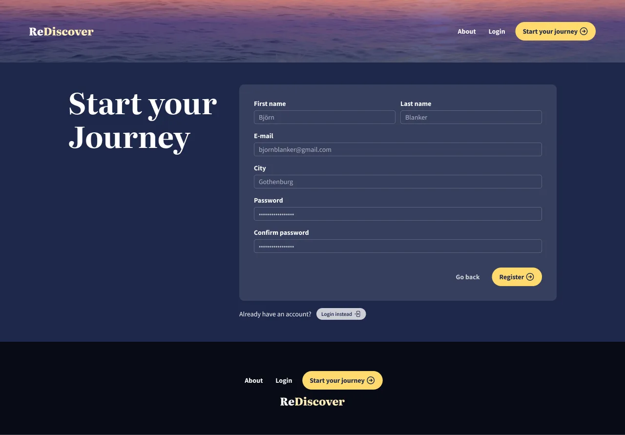
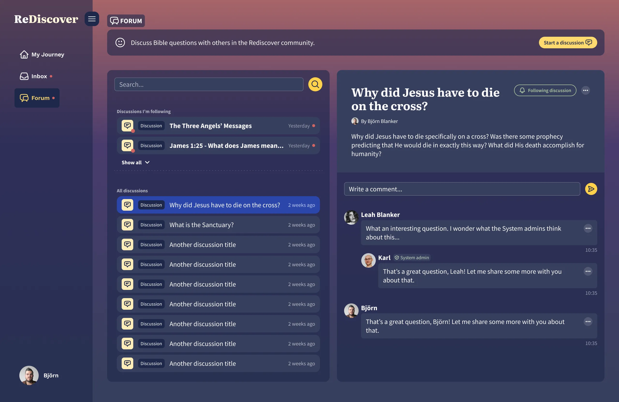
After the user research phase, I was responsible for turning the low-fidelity wireframes, along with all our valuable insights into high-fidelity interactive prototypes in Figma.
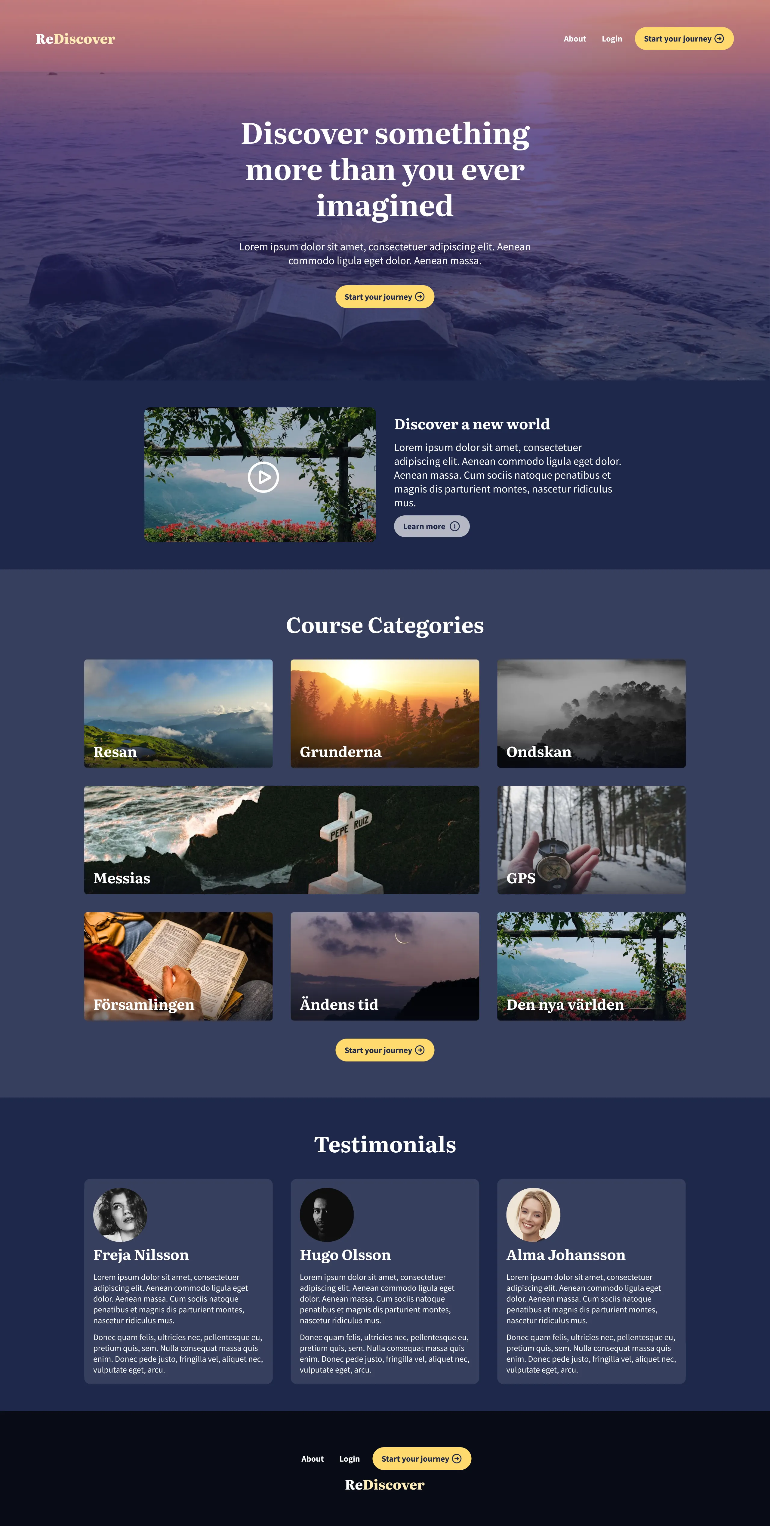
Rediscover Styleguide
Because the original Rediscover logo and branding ideas felt a bit dated, we got permission to propose a whole new brand styleguide. You can see my brand ideation at the beginning of the Figma screen recording above.
Mystery and Hope
In keeping with the name of the platform, I wanted the UI to feel modern, but yet mysterious and classic. Seeing as the Bible is known as a historical book, the overall feel of the app should convey the feeling that there’s something the user doesn’t know about this book.
This is why I ultimately chose for a relatively simple and classic logo design using a serif font along with a dark color palette for the user interface. To convey the feeling of hope that is demonstrated in the lessons of this e-platform, I chose to mimic the ombre gradient effect of a sunrise, with the background color starting dark at the bottom but getting lighter and warmer higher up on the page.
Final designs
Reflection
This project was an absolute joy to work on for me. I’m a very analytical and detail-oriented person, so I felt very comfortable doing user research for the first time. I also loved the element of using just my speech to try to figure out what the user was experiencing within the app, while trying not to speak too much.
I learned how important it is to simply watch and listen while the user interacts with the UI, while giving the absolute minimum input in order to identify areas of improvement.
Looking back, I feel like this is the main area I would like to improve in.
Besides that, I felt like the sizing of buttons and other interactive elements within my Figma prototypes wasn’t optimal, especially on mobile. I need to pay more attention to that in future projects.