Role: Product Designer
Designed the initial prototypes of an event management app for my client’s stakeholders, from UX flows all the way to polished, clickable Figma prototypes.
Timeline: 3 months
Goal: Design MVP prototype for stakeholder pitching
Constraints: Limited budget, unclear personas
Deliverables: Wireframes, flows, interactive prototype (Figma)
Outcome:
- Prototype successfully used to pitch stakeholders
- App used at real conferences
- User feedback informed later iterations
Overview
Sangana is an event management app designed to help event organizers create a more seamless and engaging experience for their attendees. The app allows users to stay informed about real-time updates, explore event schedules, and connect with other attendees.
I was brought on by the app’s developer to design the MVP prototype. The goal was to create a clear, interactive prototype that could be used to pitch the product to stakeholders and guide initial development.
Because the budget and timeline were limited, my focus was on identifying the most critical user needs and designing an intuitive experience using proven interaction patterns where appropriate, while investing more design effort in areas that would have the greatest impact on usability.
My Role
Product Designer (Freelance)
I was responsible for:
- Defining the MVP feature set in collaboration with the developer
- Designing the core user flows
- Creating wireframes and interaction patterns
- Designing the UI for key screens
- Building an interactive prototype in Figma
- Iterating based on real user feedback after initial release
The Challenge
Events often involve many simultaneous activities happening across multiple locations. Attendees frequently struggle to maintain a clear overview of what is happening, which can lead to them not getting the most out of the event.
The challenge was to design a mobile experience that would allow users to:
- Quickly understand what is happening at any given time
- Explore event details and register for sessions
- Stay informed about updates
- Connect and network with other attendees
All while working within the constraints of an MVP timeline and budget.
Design Approach
Since this was an early-stage product, there was significant uncertainty around the final user base and feature priorities. My approach was to:
- Focus on core user needs essential to the event experience
- Use familiar design patterns to reduce learning curve
- Prioritize clarity and ease of navigation
- Design a scalable foundation that could evolve over time
I created the prototype in Figma, allowing stakeholders to interact with the app flows and understand the product vision before development.
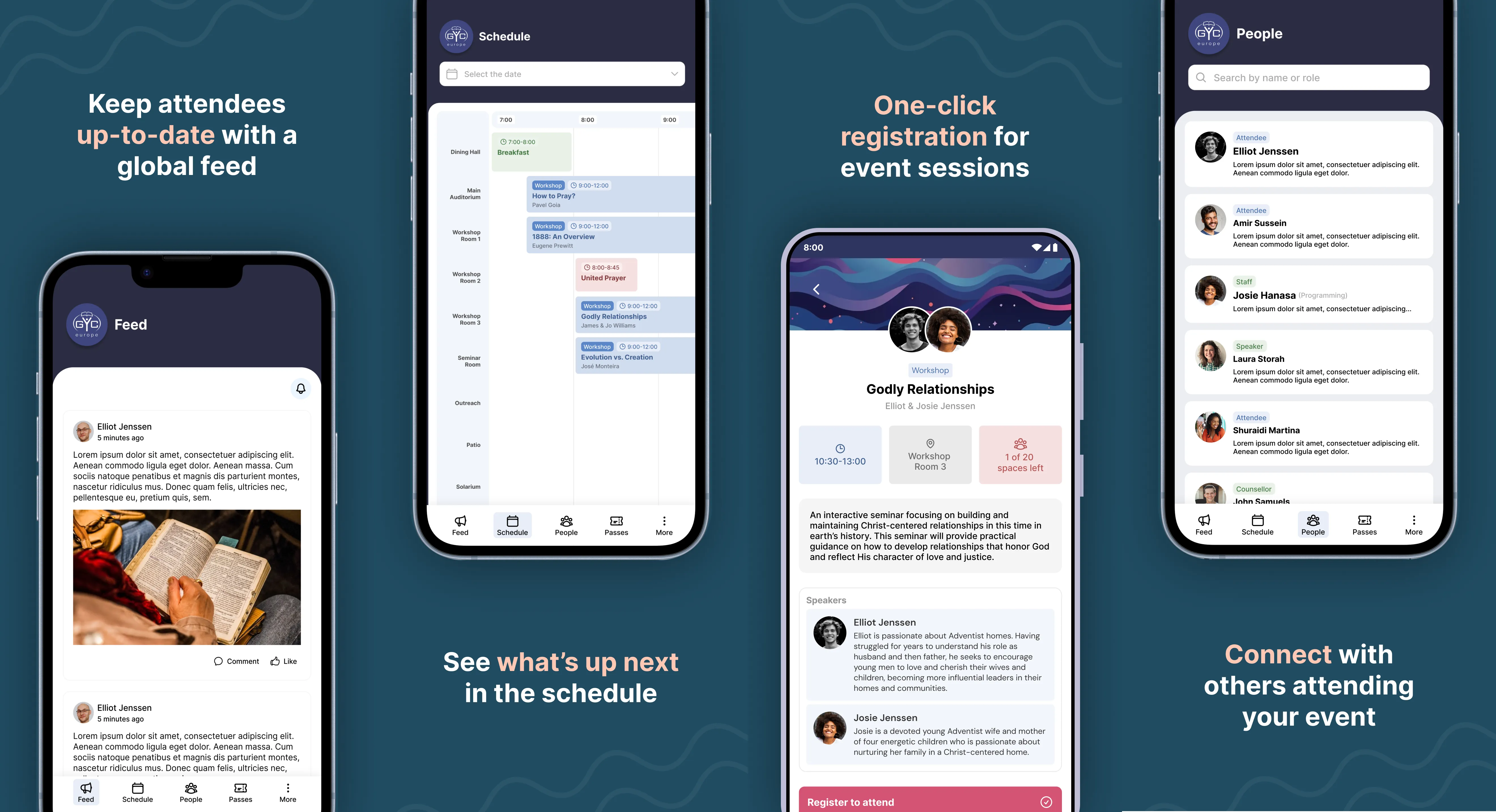
MVP Features
The basic MVP should offer a couple of the core features of the app.
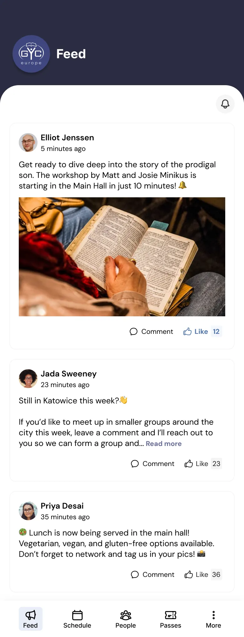
Feed
A simple “Feed” page where event managers (and other users with the appropriate features) can post updates for all users to see. Users should be able to like and comment on these updates.
Schedule
A an overview (Schedule) of all the things going on at any given moment juxtaposed to the location of each activity. Users should also be able to click on any schedule event (”activity”) and find more details about the event, the speakers/organizers leading the event, and they should also be able to register for an event and see the amount of seats remaining.
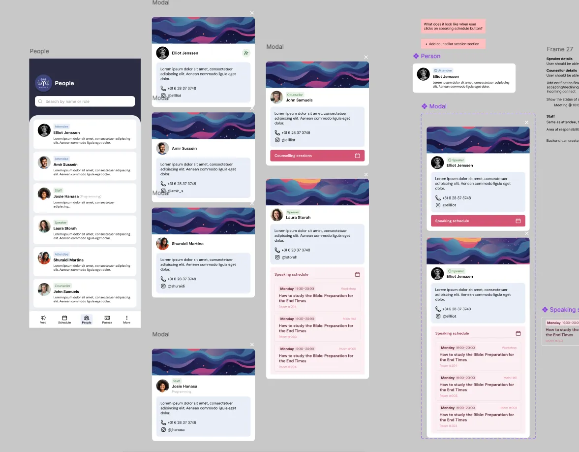
People
A page (People) where users can see a list of all the other attendees at the event for networking purposes. Each attendee should have a bio with a short blurb about them and some contact details and/or social media links.
Feed
Designing the “Feed” section of the app was one of the more straight-forward parts of the process.
Because social media Feed patterns are already familiar to most users, I intentionally reused established interaction models to reduce learning curve and development cost.
The main challenge was indicating to users the Like/Comment count and deciding how to deal with threading.
In order to avoid technical complications that would cost extra development time, we opted to skip comment replies for now and just allow users to use @username to tag another user they want to reply to. A well-designed threading solution can be added in a later version.
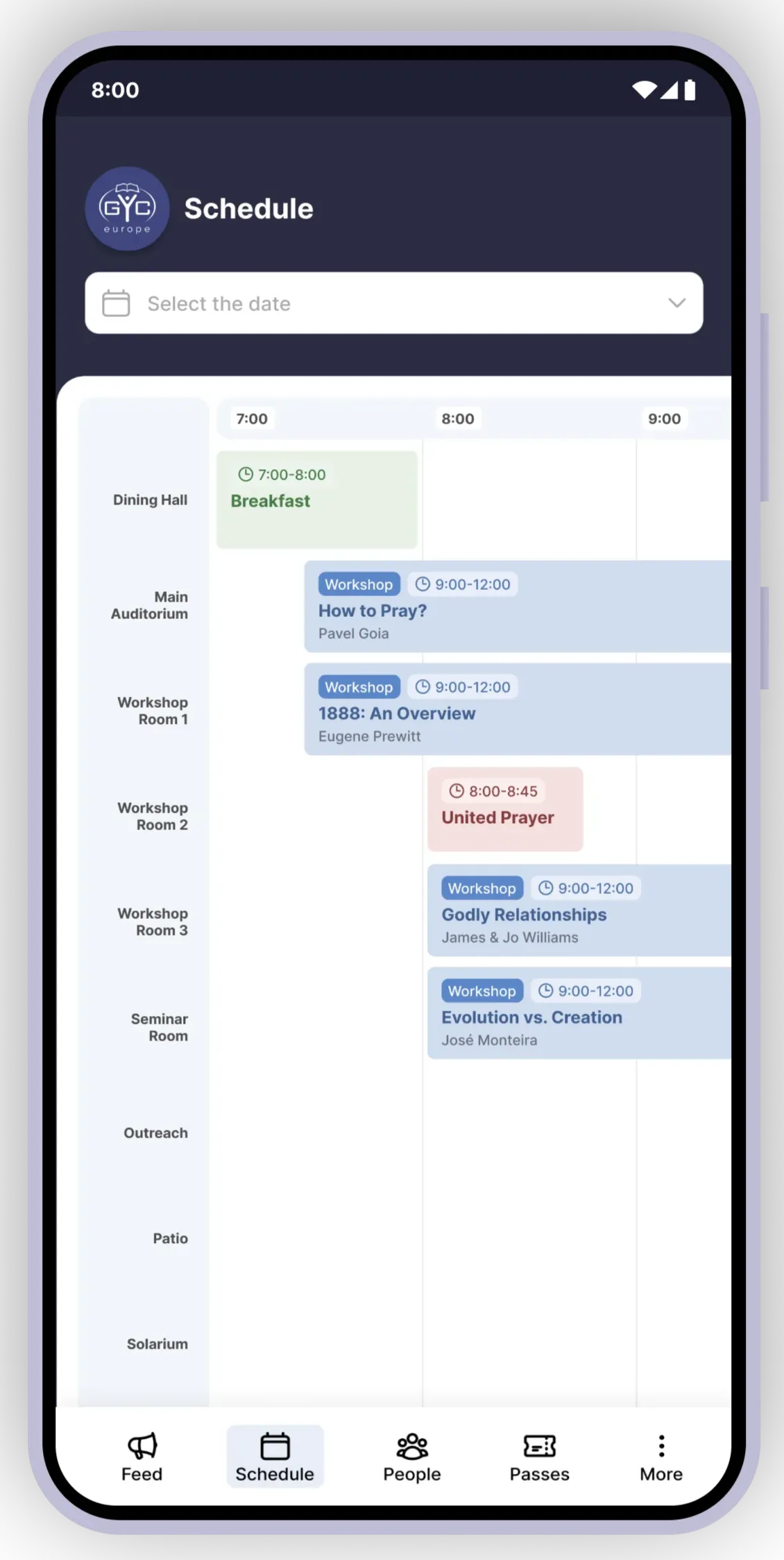
Schedule
The Schedule section was one of the more challenging sections to design well.
Initially, the request from the developer was to have an overview of all the things taking place in all of the available locations.
Problem
During big conferences, it’s the absolute worst when you choose to go to one seminar, only to find out there was another, more interesting one happening at the same time, but you didn’t realize it until it was too late.
This is the main problem we wanted to solve. The lack of oversight that often comes from having multiple things happening at the same time in different places.
Solution
In order to see as much as possible in one glance, I opted for a horizontal timeline instead of the more common (for calendar day views) vertical timeline with the locations on the y-axis. This would help users to quickly get an idea of what is going on in the next few hours and help them realize when they have choose between multiple things happening at the same time.
Update
Later on, the app was used for a couple conferences, and we were able to get lots of user feedback.
One thing that came back from users was that the schedule page had them scrolling too much and they would feel kind of lost.
It was quite clear that the lack of zoom functionality was causing users to feel like they still couldn’t see enough of the schedule at a given time and were still losing track of the overview.
However, because of the technical complexity of adding zoom functionality to the existing Schedule view, that just wasn’t an option.
So we decided to add a List view to the Schedule section.
Reflections
- One thing I would have definitely done differently: the header with event logo does not need to be as prominent as it is. It takes up too much of the space above the fold, which caused a lot of issues later. Fortunately I was able to fix this in the Redesign. Read more about that in my Sangana Redesign case study.
- It was very unclear who Sangana’s main user personas were. As a new product, there was a lot of uncertainty about exactly what type of events and event attendees would use the app. There are, of course, all types of events, event organizers and event attendees and the app developer wants all of them to enjoy using the app. However, I think I should have pushed more for spending extra time diving into this question: Who are we designing this app for? Understanding the answer to this question from the beginning of the design process would have helped us design an experience that better catered to the needs of the users.